Showing posts with label Floriated Border. Show all posts

Wednesday, March 23, 2011

Printing for Treasure Gems


Treasure Gems, a bound 4 ½ by 6 yearbook of printing contributions by members of the Amalgamated Printers Association (APA) began in 1971, the same year I joined the group. It took me a little while to get going though – my first Treasure Gems piece was a quote from Emerson printed in 1978:


Over the years my husband and I have printed several times for Treasure Gems. It’s a great opportunity to showcase printed pieces. And since people collect and save Treasure Gems booklets, it’s one way to insure that your printing will be preserved and appreciated for many years!

Some of our Treasure Gems pieces have been historical, illustrating the use of a particular typeface. For example, the “Murder She Wrote” piece below talks about Art Gothic, an 1884 typeface that was also used for titling on the former television program.


We’ve done Treasure Gems pieces that show off border, too. Two below are for Acme Border, an early 20th century geometric from the Inland Type Foundry; and for Floriated Border, an eccentric 1890 concoction of flowers, twigs, and bark, designed by the Central Type Foundry.


One of our Treasure Gems pieces used an article from an old printing magazine. "Odor of a Printshop" talked about how printers get attached to the smell of kerosene, oil, and ink. They say printing gets in your blood, but in this case it gets in your nostrils!


Sometimes we've gotten whimsical, too. “American Types” was a poem published in a 1912 printing bulletin by American Type Founders, a typecasting company. Designed to be sung to the tune of “America the Beautiful”, the poem’s multiple verses celebrated ATF’s product ― a sneaky way to advertise. We thought it was kind of fun to sing the song, despite its occasionally clunky rhymes.


On the serious side, when a printer friend of ours died suddenly, we printed “Promise to a Printer” as a memorial piece. My husband wrote a “printerly” poem and we published it in memory of our friend.


Humorous or serious, historical or not, Treasure Gems contains some of the best printing from the Amalgamated Printers Association, the letterpress group I joined 40 years ago. And what a joy to work with other printers to create a booklet that will continue to be read and enjoyed years later!

Wednesday, December 29, 2010

Something New -- New Year's Cards!


After a couple of decades of creating Christmas cards, my husband and I were struggling to come up with something new and different each year. Then an entirely different avenue beckoned — New Year’s cards! Inspired by our late printing mentor Emerson Wulling, who made New Year’s cards a holiday tradition, we decided to give them a try.

Below, Emerson Wulling's New Year's card for 1951, featuring a Robert Louis Stevenson quote.


After finding a poem by Ella Wheeler Wilcox that fit the idea of new beginnings, the rest of our 2007 New Year’s greeting came easily. We set the poem in Parsons type and our New Year’s greetings in Tiffany Gothic, then added a large and smaller cut of a clipper ship to fit the nautical theme.


For 2008 we got a little more fancy. We’d been studying and identifying some of our old wood type, so we decided to feature it on the card. Each 2008 was printed with a different wood type, the exception being the smaller black 2008 with the dots in the middle of the zeros — that’s a Central metal typeface called Atlanta. Inside we set the Rilke quote in Bewick Roman (a great 19th century typeface recast by Skyline Type Foundry) and added our good wishes for the year in Washington, another old Central Type Foundry face.


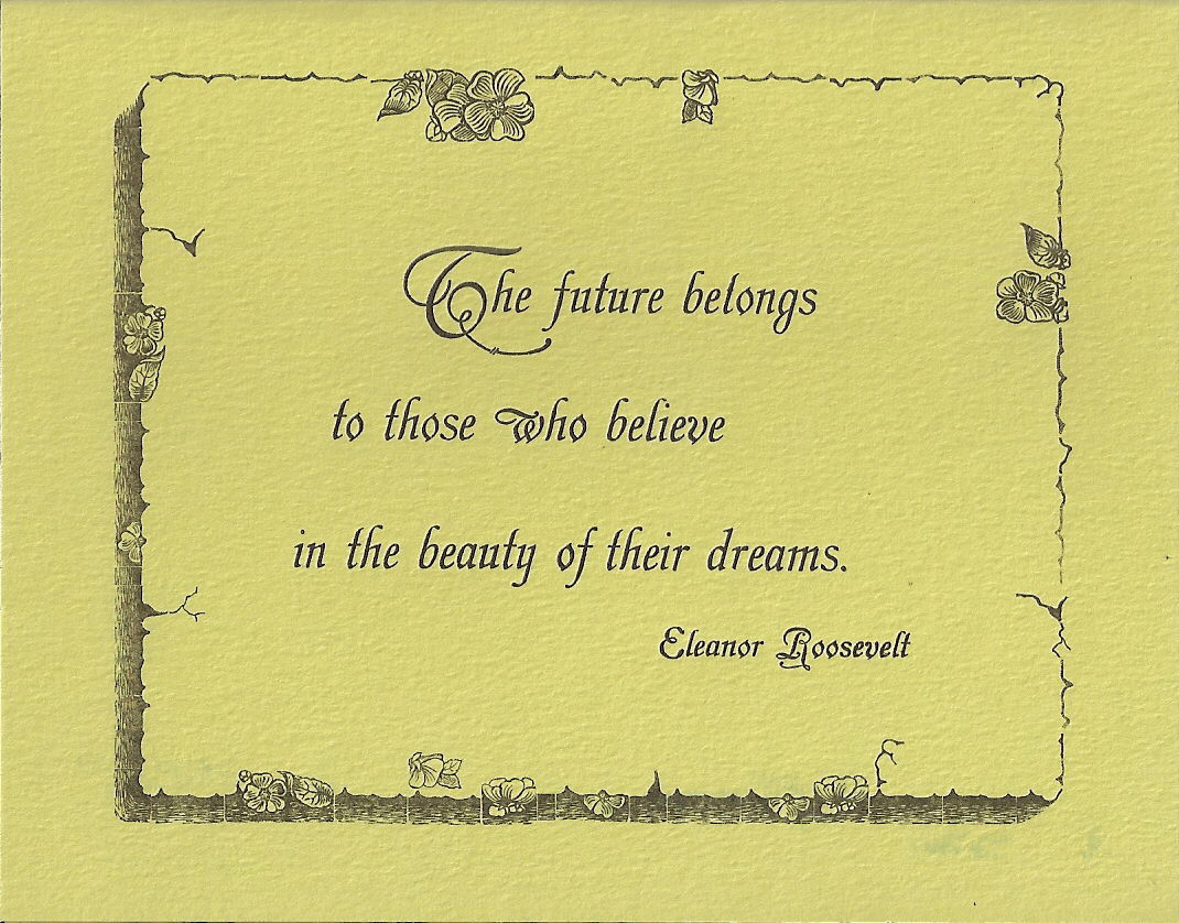
We used one of our latest “finds” on our 2009 New Year’s card: an unusual old border, Floriated Border, rescued from a moldering case we discovered in an antique store in Paducah, Kentucky. The tiny pieces of twig, flower, and bark border were hard to set, but created an interesting result. And we really liked the quote from Eleanor Roosevelt, which we set in Grolier, a gorgeous old MacKellar, Smiths and Jordan Type Foundry face. The inside of the card also included Extra Ornamented #2 and Geometric Italic.


After we bought a book last year with examples of artistic 19th century printing, we decided to experiment a little with color on our 2010 New Year’s card. We tried several different color combinations (including seasonal red and green) before settling on yellow, green, and dark brown ink on cream paper. The yellow impression was laid down first, followed by the green and then the brown. “2010” is printed in Arboret, a 19th century MacKellar face. Inside we used Caslon Open and Caslon Italic in brown and green tones to set the poem by Whittier.


We’ve printed five New Year’s cards now, and we’re still full of ideas. And we’ve found that New Year’s cards offer the letterpress printer some advantages: 1) the chance to use inspirational, optimistic quotes/poetry about the future; 2) the opportunity to feature fancy old numerals; and, happily 3) a bit more time to get the holiday cards printed and mailed out!

So... we wish you a very Happy New Year! Thank you for reading this blog, and I look forward to sharing more with you in 2011!