
Letterpress printing is one process where the end justifies the means. You try to get the most attractive printed piece, regardless of what nutty method you use to get there. Make-ready, that innocent sounding term, means getting the entire form to print evenly. Not so easy with older, worn type and cuts!
In theory, make-ready consists of underlays and overlays (see pictures below). You put small pieces of paper called underlays behind the form in the press. Or you put pieces of paper called overlays beneath or on top of the tympan paper. Underlays and overlays increase pressure on the parts of the form that aren’t printing well and make them print darker.
 Here's the form for a Thank You card before make-ready.
 The A, K, and O aren't printing well, so we added underlays beneath the letters to make them print darker.
 Here's the overlay, a sheet of paper beneath the tympan paper to strengthen general impression.
 And here's the finished Thank You card, looking a lot more even.
That’s the theory. In practice you can end up with a crazy quilt of little bits of paper held on with adhesive tape. Then there are the great equalizers, ideally spongy materials that will either pad out the type or squish down to nothing. Facial tissue is one. A printer friend of my father’s always used a sheet of X-ray film packed under the tympan. Every printer has their own secret (or not so secret) method for getting an uneven form to print. So long as it works, anything goes!
Often older type and cuts aren’t exactly type-high. (Type-high is 0.918 inch from foot to printing surface—and come to think of it, how did somebody come up with that odd measurement?) They may be worn down from too much use, or they weren’t manufactured type-high in the first place.
Sometimes you’re pretty much defeated from the start. For example: look closely at the two U’s in the font of 4 line Pica Ornamented below. Because they were cast incorrectly, both U’s sink in the middle. So try to print a July calendar page using one of those U’s. After much padding, packing, and muttered words, the results were still less than ideal.
 A font of 4 line Pica Ornamented -- pretty old stuff, and it's not all type-high.
 Can you see the sunken U? It's almost concave, with a big dip in the center.
 After much fiddling, this was the best the U would print.
Older cuts are notorious for make-ready problems, especially if you use several in one piece. It’s like trying to get a roomful of opinioned people to agree on religion or politics. You could say every cut has its own idea of type-high. When my husband and I printed the piece below with a bunch of old advertising cuts from a print shop we bought out, we had to get pretty creative with the make-ready. The patchwork on the tympan was a mess, but the result, happily, was better that the U in our July calendar.

Old wood type can create another make-ready nightmare. There are high letters, low letters, and maybe a few that are just right. It can be a challenge to get larger wood type to ink evenly anyway, especially on a platen press. Below is a poster we printed using wood type, metal type, and a very old cut – a real exercise in make-ready. But the fun we had dreaming up copy for the poster made up for the tough time we had printing it.
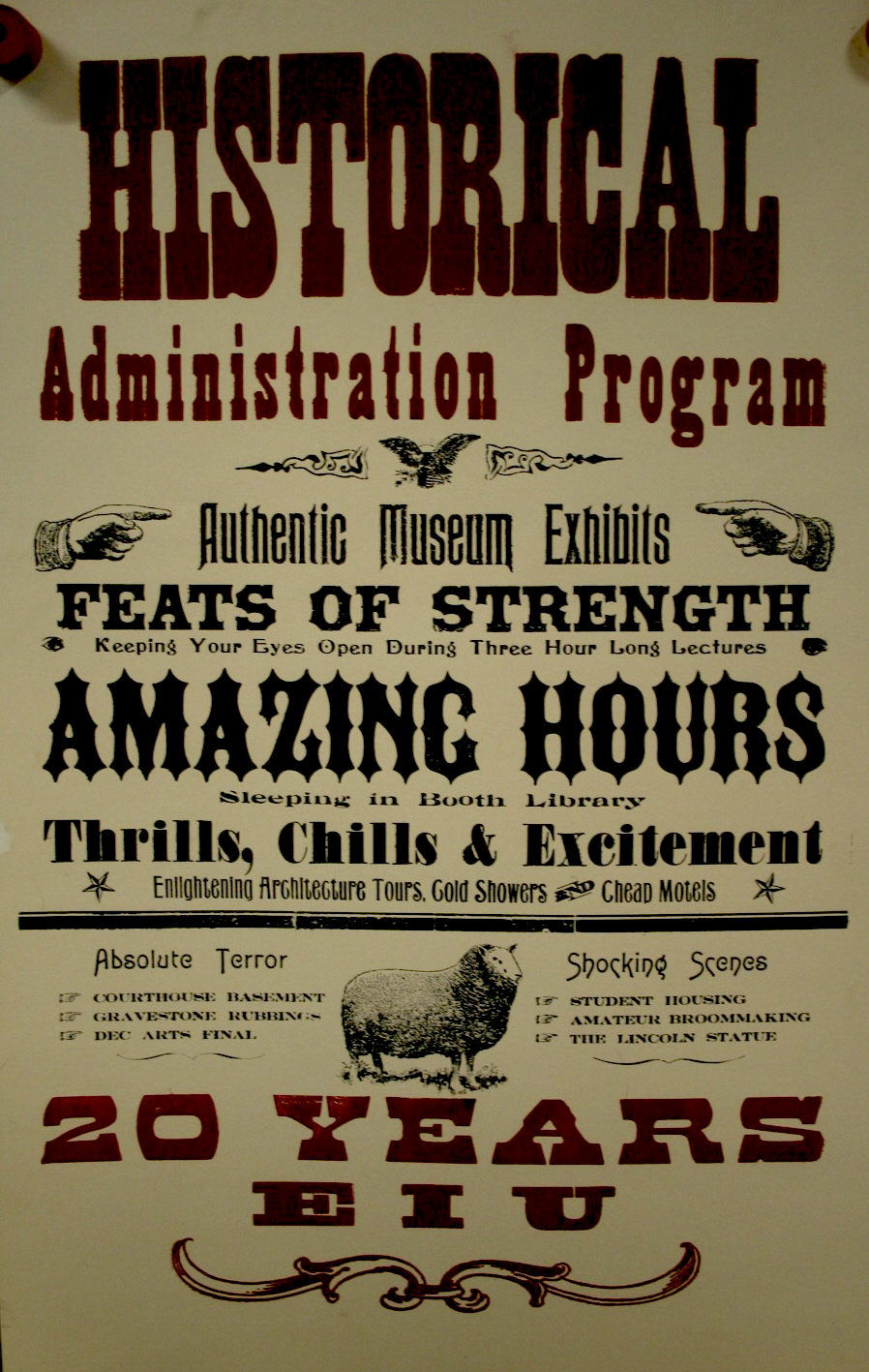
Just remember, the key to make-ready is patience. It helps to think outside the box, too. Use whatever you can to make it print!


