Showing posts with label Arboret. Show all posts

Wednesday, December 29, 2010

Something New -- New Year's Cards!


After a couple of decades of creating Christmas cards, my husband and I were struggling to come up with something new and different each year. Then an entirely different avenue beckoned — New Year’s cards! Inspired by our late printing mentor Emerson Wulling, who made New Year’s cards a holiday tradition, we decided to give them a try.

Below, Emerson Wulling's New Year's card for 1951, featuring a Robert Louis Stevenson quote.


After finding a poem by Ella Wheeler Wilcox that fit the idea of new beginnings, the rest of our 2007 New Year’s greeting came easily. We set the poem in Parsons type and our New Year’s greetings in Tiffany Gothic, then added a large and smaller cut of a clipper ship to fit the nautical theme.


For 2008 we got a little more fancy. We’d been studying and identifying some of our old wood type, so we decided to feature it on the card. Each 2008 was printed with a different wood type, the exception being the smaller black 2008 with the dots in the middle of the zeros — that’s a Central metal typeface called Atlanta. Inside we set the Rilke quote in Bewick Roman (a great 19th century typeface recast by Skyline Type Foundry) and added our good wishes for the year in Washington, another old Central Type Foundry face.


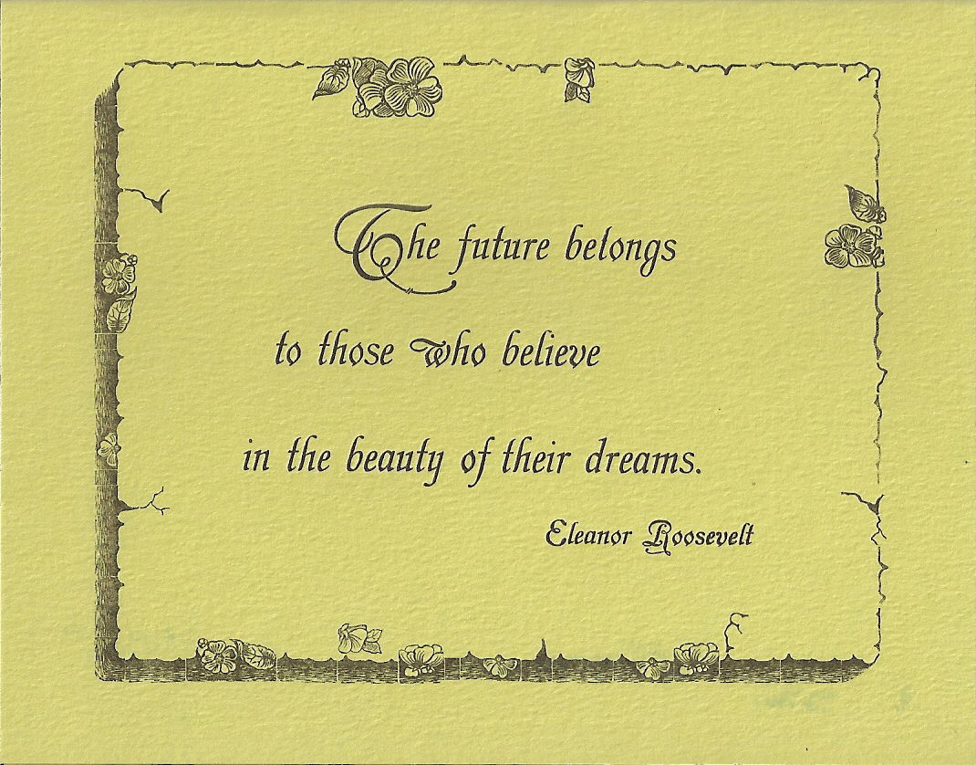
We used one of our latest “finds” on our 2009 New Year’s card: an unusual old border, Floriated Border, rescued from a moldering case we discovered in an antique store in Paducah, Kentucky. The tiny pieces of twig, flower, and bark border were hard to set, but created an interesting result. And we really liked the quote from Eleanor Roosevelt, which we set in Grolier, a gorgeous old MacKellar, Smiths and Jordan Type Foundry face. The inside of the card also included Extra Ornamented #2 and Geometric Italic.


After we bought a book last year with examples of artistic 19th century printing, we decided to experiment a little with color on our 2010 New Year’s card. We tried several different color combinations (including seasonal red and green) before settling on yellow, green, and dark brown ink on cream paper. The yellow impression was laid down first, followed by the green and then the brown. “2010” is printed in Arboret, a 19th century MacKellar face. Inside we used Caslon Open and Caslon Italic in brown and green tones to set the poem by Whittier.


We’ve printed five New Year’s cards now, and we’re still full of ideas. And we’ve found that New Year’s cards offer the letterpress printer some advantages: 1) the chance to use inspirational, optimistic quotes/poetry about the future; 2) the opportunity to feature fancy old numerals; and, happily 3) a bit more time to get the holiday cards printed and mailed out!

So... we wish you a very Happy New Year! Thank you for reading this blog, and I look forward to sharing more with you in 2011!

Wednesday, November 17, 2010

Favorite Victorian Typefaces


The printed invitation at the top of this blog shows a few of my favorite 19th century type faces from our shop. “St. Louis Letterpress Society presents” is printed in Camelot Oldstyle, an early Goudy face. Between the pointing fingers, or “fists” as printers call them, is French Clarendon from the Johnson Type Foundry. “Really, truly, ugly” is printed in Scribner, a Central Type Foundry typeface that wanders all over the place. “Nineteenth” is Old Style Bold from Central Type Foundry; “Century” is Vanity Fair; and “Typefaces” is Gold Rush. The small type describing the talk is Drexel from the Keystone Foundry. The date is printed in Grant from Barnhart Brothers and Spindler, and the address is in Jim Crow. “Webster Groves” is Title Text Open from Johnson; “5:00 P.M.” is Thunderbird from the Phoenix Type Foundry ; and “Potluck Dinner” is Vertical Script. The remaining text is Devinne, and the border at the bottom was rescued from an old print shop in Marthasville, Missouri that went through a major flood.

Bizarre, florid, garish — these are just a few ways to describe Victorian advertising typefaces. Like furniture and home furnishings of the time, they were fussy and highly decorative. I like their curlicues and squiggles, their lack of subtlety. Every one is different. They’re like extroverts, each one shouting, “Look at me!”

Printers didn’t use type subtly in that era, either. Instead they printed line after line of eccentric typefaces, one after another, showing off as many different fonts from their print shops as possible. The effect was attention-getting, to say the least. Of course that’s just what the advertiser wanted to do to sell merchandise.

My husband and I have been fortunate enough to collect a number of these fascinating old typefaces and use them in our printing. They’re fun to work with, and I love seeing the imaginative ways their designers interpreted the alphabet!


A similar announcement with a circus clown has a variety of old Victorian type faces in it. “Ladies and Gentlemen” is printed in Circus; “Your Attention Please” is a Smithsonian recasting called Ornamented; “Is your ticket to” is French Antique Extended; “A Grand Compendium of Typographical Expression” is Grant; “Available Only to Those Bold Enough to Participate” is French Old Style; and the small type at the bottom is Drexel.


The piece on mowing machines features Arboret, another favorite Victorian typeface of mine. Designed by MacKellar, Smiths and Jordan Type Foundry to look like leaves decorating letters of the alphabet, it dates from about 1884. The old mowing machine cut was found on EBay.


Two older typefaces in our collection I appreciate are Black Ray Shaded and Black Open. Both were produced by the Bruce Type Foundry — Black Ray Shaded about 1870, and Black Open about 1882. Their formality suggests usage in wedding invitations, formal announcements, church literature, and the like.


A less ornate typeface, but still one of my favorites is St. John, designed by the Inland Type Foundry close to the end of the 19th century in 1895. It has an art nouveau flair to it, like other type faces that would follow it in the early 20th century.

Sadly, many of the older Victorian type faces were melted down in the 20th century after they were no longer fashionable. That makes those that survived that much more desirable to acquire. They represent “a grand compendium of typographical expression” indeed!