Showing posts with label Scribner. Show all posts

Friday, September 14, 2012

Extinct Typefaces

Can typefaces become extinct, like dinosaurs? Not quite, but they can become hard to find. Computers offer fonts galore. But one of the delights of being a letterpress printer is the ability to use fonts that are available only in metal or wood. Personally I love using typefaces you can’t find in font software or on the Internet. That way nobody will pick up my letterpress printing and say, “Did you do this on your computer?” Ouch! Not the best thing to say to someone who’s spent hours setting slivers of metal type by hand.

Here are a few of my favorite extinct typefaces. These are creations of the 19th century, though some more modern faces have become extinct, too.

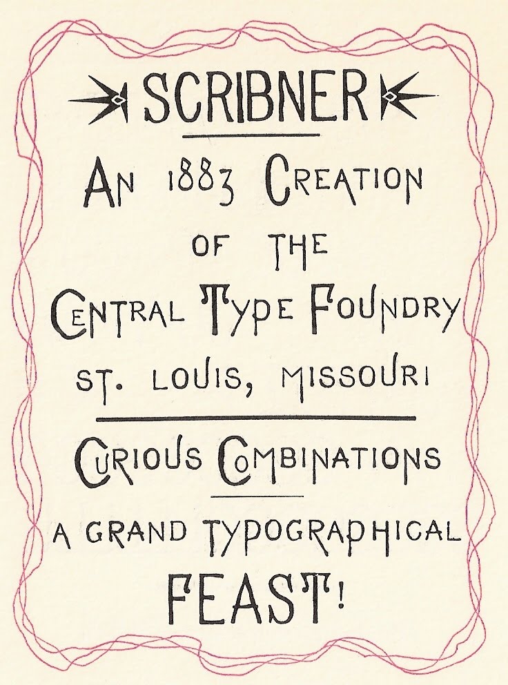
Scribner, illustrated above and at the top of this page, can best be described as eccentric. The wiggly, curlicued letters, designed by the Central Type Foundry of St. Louis in 1883, seem to wander all over the place. Below is a piece we printed that takes advantage of this tendency.
The “Attitudes” piece above is printed in Grolier, an elegant MacKellar, Smiths, and Jordan script from 1887 designed by Herman Ihlenberg. This lovely face is hard to find, sadly. My husband Bob and I have metal fonts of it in 12, 18, and 24 point. Its fragile kerns have held up over time thanks to careful storage and babying. The design is timeless, as beautiful in the 21st century as when it was created. Below is a valentine that shows off some of Grolier’s gorgeous capital letters.


Vertical Writing is another favorite of mine that you don’t find available very often. Joseph W. Phinney patented it 1898 for the Boston branch of American Type Founders. Designed to look like informal 19th century handwriting, its letters appear to be fully connected and widely spaced. It’s surprisingly legible, and quite charming in an old-fashioned way.
If you’re sad because you don’t have “extinct typefaces” at your disposal, there’s a way to remedy that. Some of the older fonts are being recast and are available again.

One of my favorites is Freak, recently produced by Sky Shipley of Skyline Type Foundry http://skylinetype.com. This wildly eccentric 1889 gem is pictured below.

Yes, fonts are fun, and especially if you’re using one that very few people commonly see. Using extinct typefaces is a big perk of letterpress printing. It’s great to be able to share them with the world!


Wednesday, November 17, 2010

Favorite Victorian Typefaces


The printed invitation at the top of this blog shows a few of my favorite 19th century type faces from our shop. “St. Louis Letterpress Society presents” is printed in Camelot Oldstyle, an early Goudy face. Between the pointing fingers, or “fists” as printers call them, is French Clarendon from the Johnson Type Foundry. “Really, truly, ugly” is printed in Scribner, a Central Type Foundry typeface that wanders all over the place. “Nineteenth” is Old Style Bold from Central Type Foundry; “Century” is Vanity Fair; and “Typefaces” is Gold Rush. The small type describing the talk is Drexel from the Keystone Foundry. The date is printed in Grant from Barnhart Brothers and Spindler, and the address is in Jim Crow. “Webster Groves” is Title Text Open from Johnson; “5:00 P.M.” is Thunderbird from the Phoenix Type Foundry ; and “Potluck Dinner” is Vertical Script. The remaining text is Devinne, and the border at the bottom was rescued from an old print shop in Marthasville, Missouri that went through a major flood.

Bizarre, florid, garish — these are just a few ways to describe Victorian advertising typefaces. Like furniture and home furnishings of the time, they were fussy and highly decorative. I like their curlicues and squiggles, their lack of subtlety. Every one is different. They’re like extroverts, each one shouting, “Look at me!”

Printers didn’t use type subtly in that era, either. Instead they printed line after line of eccentric typefaces, one after another, showing off as many different fonts from their print shops as possible. The effect was attention-getting, to say the least. Of course that’s just what the advertiser wanted to do to sell merchandise.

My husband and I have been fortunate enough to collect a number of these fascinating old typefaces and use them in our printing. They’re fun to work with, and I love seeing the imaginative ways their designers interpreted the alphabet!


A similar announcement with a circus clown has a variety of old Victorian type faces in it. “Ladies and Gentlemen” is printed in Circus; “Your Attention Please” is a Smithsonian recasting called Ornamented; “Is your ticket to” is French Antique Extended; “A Grand Compendium of Typographical Expression” is Grant; “Available Only to Those Bold Enough to Participate” is French Old Style; and the small type at the bottom is Drexel.


The piece on mowing machines features Arboret, another favorite Victorian typeface of mine. Designed by MacKellar, Smiths and Jordan Type Foundry to look like leaves decorating letters of the alphabet, it dates from about 1884. The old mowing machine cut was found on EBay.


Two older typefaces in our collection I appreciate are Black Ray Shaded and Black Open. Both were produced by the Bruce Type Foundry — Black Ray Shaded about 1870, and Black Open about 1882. Their formality suggests usage in wedding invitations, formal announcements, church literature, and the like.


A less ornate typeface, but still one of my favorites is St. John, designed by the Inland Type Foundry close to the end of the 19th century in 1895. It has an art nouveau flair to it, like other type faces that would follow it in the early 20th century.

Sadly, many of the older Victorian type faces were melted down in the 20th century after they were no longer fashionable. That makes those that survived that much more desirable to acquire. They represent “a grand compendium of typographical expression” indeed!

Wednesday, June 30, 2010

Why I'm A Hobby Printer


Why am I a hobby printer? Why not make money with our letterpress shop? With the current popularity of letterpress wedding invitations, birth announcements, and other hand-crafted pieces, there’s a market for what my husband and I could produce. Despite this, we have remained primarily printing hobbyists.

The growing appeal of letterpress to the general public is certainly a trend I applaud. More people are recognizing the beauty and skill that goes into creating a handmade printed piece. And why not commemorate a wedding, anniversary, or birth with something one of a kind? I’ve seen wonderful creativity go into many of these letterpress pieces for hire done by other printers.

But instead of dealing with sometimes demanding customers, Bob and I have chosen to print what we want, when we want, how we want. It’s just the way we are. We’re stubbornly independent, and if we printed mainly for money it would take much of the joy out of it for us. So apart from the occasional job that interests us, we choose what we want to print − a poem, a saying, a holiday card, a booklet, a historical piece. We design and print each piece the way we want to print it. This keeps letterpress open-ended and exciting for us.

Something we’ve had fun doing over the years is using our press to print quotes that are significant to ourselves or others. For example, the custodian at the public library where I worked found a battered photocopy of a quote on attitudes inside a returned library book. He shared it with me, since it was a favorite of his. When he retired, Bob and I printed and framed the quote and gave it to him. I know it was one of the more meaningful gifts that he received.

Another friend had a favorite saying that we printed to decorate her desk at work: “Blessed are the flexible, for they shall not be bent out of shape.” We enjoyed designing the piece using old Victorian type that bent and curved, with a wiggly border to match.

We have a friend who loves to go out for breakfast, so much so that he calls himself, “The Commissioner of Breakfast”. We printed a business card for him to leave at restaurants where he’d had an especially good breakfast − and we liked the idea so much that we printed cards for ourselves, too. It’s amazing to see how happy you can make a waiter or waitress by handing them a simple hand-printed card. Interestingly, people tend to believe there’s really a Commissioner of Breakfast, even when you tell them it’s a joke − if it’s printed on a business card, it must be true, right?

One piece we printed, “Destined for Greatness...” sums up much of the feeling I have towards printing for pleasure. When I print I try to remember to take it easy, pace myself, and remember that the things I do just for the love and joy of it truly matter.


This quote on attitudes by an anonymous author was printed in Grolier with Empire border.


The eccentricities of Scribner by the Central Type Foundry of St Louis fit this quote.


We love handing these out whenever we have an especially good restaurant breakfast.

Wednesday, June 2, 2010

My Favorite Typeface(s)

Naming a favorite typeface is like saying which of your children you like the best. I like too many typefaces to choose one favorite. In fact I like too many typefaces for my own good, but that’s beside the point. Picking one favorite is limiting. From the type we have, I can pick one favorite body type, one italic, one display type, one text, one uncial, one antique type − maybe.

After all, different typefaces are good for printing different things. If you’re doing an art deco piece, you need art deco type. If you’re quoting Dickens, something like Caslon would be appropriate. Doing a Christmas card or something religious ─ use text. Something medieval − maybe an uncial. Something Victorian − a medley of wildly eccentric typefaces from the 19th century. Typefaces have all kinds of flavors, and like gourmet jelly beans, different combinations create an entirely new experience.

But back to favorites: for body type (type used for the bulk of material in a piece) I would pick Italian Old Style. I enjoy setting and reading it, probably because of its openness and clarity. And we have a nice assortment of sizes in roman, italic, and small caps. But I like Caslon, Garamond, Devinne, and LaClede Old Style, too. How can I choose just one!

A quote in Italian Oldstyle, with Hadriano Stonecut for the title.


My favorite italic type would be a tie between Caslon Italic 471 (with long descenders) and Grolier, a beautiful old MacKellar face with kerned characters. Are two favorites okay?

A Christmas card using Caslon Italic 471 for a quote from Dickens.


A Valentine showing the flourishes of Grolier, an elegant kerned font from MacKellar, Smiths, and Jordan.


For display type, a favorite is Legend, with its Arabian Nights look. Then there’s Parsons, with its wonderful ascenders and descenders, full of design possibilities. So many great display types are out there − Hadriano Stonecut, Schoeffer Condensed, Parisian − each perfect for a certain kind of printed piece.

Legend type, used for the title page of "A Tale of Arabia".

Parsons by Will Ransom has many optional ascenders and descenders, but the trick is figuring out where to use them.


Text type is easier to decide on. Washington Text has the less conventional text look I prefer. For text-like appearance that’s not quite text, I like the pen-lettering look of Freehand.

Washington Text, a text type from the Keystone Type Foundry.


A Christmas card using Freehand, a versatile pen-lettering typeface.


With uncials, that ancient medieval letterform, my favorite is Worrell Uncial. Though we only have it in 12 point, we use it often.

A prop card using Worrell Uncial to print "A Private Press Dedicated to Printing for Pleasure, Self-Expression, and the Preservation of Letterpress Printing History".


Choose one favorite antique type − impossible! They’re as individual and eccentric as a ninety year old maiden aunt. But if I had to choose, candidates for me would include Scribner, Art Gothic, and Atlanta.

Scribner, an eccentric typeface from the Central Type Foundry of St. Louis, is fun to play with.


Some types I lust for include Goudy Mediaeval, Civilite, and anything unusual or antique. Type lust, I must confess, is a disease. You know you’ve got it when you find yourself drooling over fonts and specimen books.

Is there any type I don’t like? Yes. Brush. It’s thick, clunky, and often badly used. Brush sets my teeth on edge. Thankfully we no longer own any.

So ... what’s your favorite typeface?