Showing posts with label Grolier. Show all posts

Friday, September 14, 2012

Extinct Typefaces

Can typefaces become extinct, like dinosaurs? Not quite, but they can become hard to find. Computers offer fonts galore. But one of the delights of being a letterpress printer is the ability to use fonts that are available only in metal or wood. Personally I love using typefaces you can’t find in font software or on the Internet. That way nobody will pick up my letterpress printing and say, “Did you do this on your computer?” Ouch! Not the best thing to say to someone who’s spent hours setting slivers of metal type by hand.

Here are a few of my favorite extinct typefaces. These are creations of the 19th century, though some more modern faces have become extinct, too.

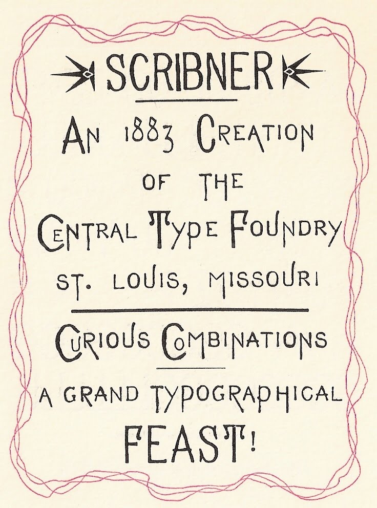
Scribner, illustrated above and at the top of this page, can best be described as eccentric. The wiggly, curlicued letters, designed by the Central Type Foundry of St. Louis in 1883, seem to wander all over the place. Below is a piece we printed that takes advantage of this tendency.
The “Attitudes” piece above is printed in Grolier, an elegant MacKellar, Smiths, and Jordan script from 1887 designed by Herman Ihlenberg. This lovely face is hard to find, sadly. My husband Bob and I have metal fonts of it in 12, 18, and 24 point. Its fragile kerns have held up over time thanks to careful storage and babying. The design is timeless, as beautiful in the 21st century as when it was created. Below is a valentine that shows off some of Grolier’s gorgeous capital letters.


Vertical Writing is another favorite of mine that you don’t find available very often. Joseph W. Phinney patented it 1898 for the Boston branch of American Type Founders. Designed to look like informal 19th century handwriting, its letters appear to be fully connected and widely spaced. It’s surprisingly legible, and quite charming in an old-fashioned way.
If you’re sad because you don’t have “extinct typefaces” at your disposal, there’s a way to remedy that. Some of the older fonts are being recast and are available again.

One of my favorites is Freak, recently produced by Sky Shipley of Skyline Type Foundry http://skylinetype.com. This wildly eccentric 1889 gem is pictured below.

Yes, fonts are fun, and especially if you’re using one that very few people commonly see. Using extinct typefaces is a big perk of letterpress printing. It’s great to be able to share them with the world!


Wednesday, December 29, 2010

Something New -- New Year's Cards!


After a couple of decades of creating Christmas cards, my husband and I were struggling to come up with something new and different each year. Then an entirely different avenue beckoned — New Year’s cards! Inspired by our late printing mentor Emerson Wulling, who made New Year’s cards a holiday tradition, we decided to give them a try.

Below, Emerson Wulling's New Year's card for 1951, featuring a Robert Louis Stevenson quote.


After finding a poem by Ella Wheeler Wilcox that fit the idea of new beginnings, the rest of our 2007 New Year’s greeting came easily. We set the poem in Parsons type and our New Year’s greetings in Tiffany Gothic, then added a large and smaller cut of a clipper ship to fit the nautical theme.


For 2008 we got a little more fancy. We’d been studying and identifying some of our old wood type, so we decided to feature it on the card. Each 2008 was printed with a different wood type, the exception being the smaller black 2008 with the dots in the middle of the zeros — that’s a Central metal typeface called Atlanta. Inside we set the Rilke quote in Bewick Roman (a great 19th century typeface recast by Skyline Type Foundry) and added our good wishes for the year in Washington, another old Central Type Foundry face.


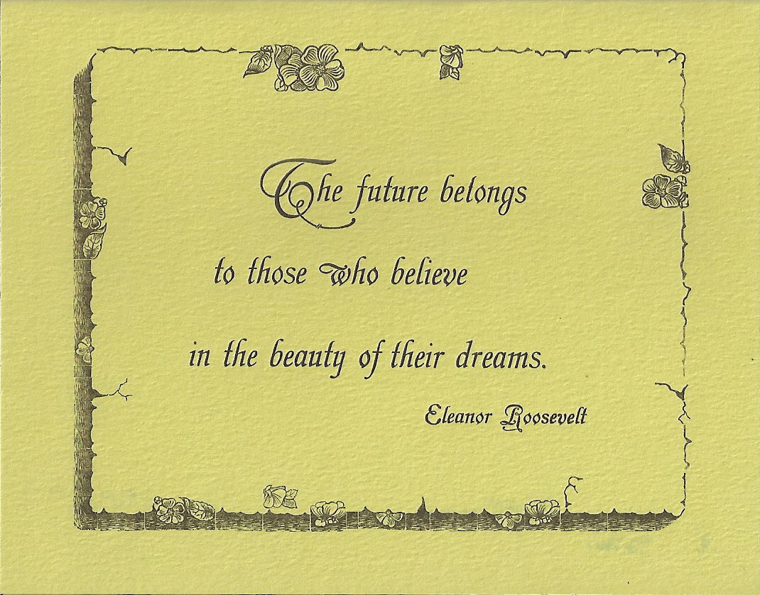
We used one of our latest “finds” on our 2009 New Year’s card: an unusual old border, Floriated Border, rescued from a moldering case we discovered in an antique store in Paducah, Kentucky. The tiny pieces of twig, flower, and bark border were hard to set, but created an interesting result. And we really liked the quote from Eleanor Roosevelt, which we set in Grolier, a gorgeous old MacKellar, Smiths and Jordan Type Foundry face. The inside of the card also included Extra Ornamented #2 and Geometric Italic.


After we bought a book last year with examples of artistic 19th century printing, we decided to experiment a little with color on our 2010 New Year’s card. We tried several different color combinations (including seasonal red and green) before settling on yellow, green, and dark brown ink on cream paper. The yellow impression was laid down first, followed by the green and then the brown. “2010” is printed in Arboret, a 19th century MacKellar face. Inside we used Caslon Open and Caslon Italic in brown and green tones to set the poem by Whittier.


We’ve printed five New Year’s cards now, and we’re still full of ideas. And we’ve found that New Year’s cards offer the letterpress printer some advantages: 1) the chance to use inspirational, optimistic quotes/poetry about the future; 2) the opportunity to feature fancy old numerals; and, happily 3) a bit more time to get the holiday cards printed and mailed out!

So... we wish you a very Happy New Year! Thank you for reading this blog, and I look forward to sharing more with you in 2011!

Wednesday, June 2, 2010

My Favorite Typeface(s)

Naming a favorite typeface is like saying which of your children you like the best. I like too many typefaces to choose one favorite. In fact I like too many typefaces for my own good, but that’s beside the point. Picking one favorite is limiting. From the type we have, I can pick one favorite body type, one italic, one display type, one text, one uncial, one antique type − maybe.

After all, different typefaces are good for printing different things. If you’re doing an art deco piece, you need art deco type. If you’re quoting Dickens, something like Caslon would be appropriate. Doing a Christmas card or something religious ─ use text. Something medieval − maybe an uncial. Something Victorian − a medley of wildly eccentric typefaces from the 19th century. Typefaces have all kinds of flavors, and like gourmet jelly beans, different combinations create an entirely new experience.

But back to favorites: for body type (type used for the bulk of material in a piece) I would pick Italian Old Style. I enjoy setting and reading it, probably because of its openness and clarity. And we have a nice assortment of sizes in roman, italic, and small caps. But I like Caslon, Garamond, Devinne, and LaClede Old Style, too. How can I choose just one!

A quote in Italian Oldstyle, with Hadriano Stonecut for the title.


My favorite italic type would be a tie between Caslon Italic 471 (with long descenders) and Grolier, a beautiful old MacKellar face with kerned characters. Are two favorites okay?

A Christmas card using Caslon Italic 471 for a quote from Dickens.


A Valentine showing the flourishes of Grolier, an elegant kerned font from MacKellar, Smiths, and Jordan.


For display type, a favorite is Legend, with its Arabian Nights look. Then there’s Parsons, with its wonderful ascenders and descenders, full of design possibilities. So many great display types are out there − Hadriano Stonecut, Schoeffer Condensed, Parisian − each perfect for a certain kind of printed piece.

Legend type, used for the title page of "A Tale of Arabia".

Parsons by Will Ransom has many optional ascenders and descenders, but the trick is figuring out where to use them.


Text type is easier to decide on. Washington Text has the less conventional text look I prefer. For text-like appearance that’s not quite text, I like the pen-lettering look of Freehand.

Washington Text, a text type from the Keystone Type Foundry.


A Christmas card using Freehand, a versatile pen-lettering typeface.


With uncials, that ancient medieval letterform, my favorite is Worrell Uncial. Though we only have it in 12 point, we use it often.

A prop card using Worrell Uncial to print "A Private Press Dedicated to Printing for Pleasure, Self-Expression, and the Preservation of Letterpress Printing History".


Choose one favorite antique type − impossible! They’re as individual and eccentric as a ninety year old maiden aunt. But if I had to choose, candidates for me would include Scribner, Art Gothic, and Atlanta.

Scribner, an eccentric typeface from the Central Type Foundry of St. Louis, is fun to play with.


Some types I lust for include Goudy Mediaeval, Civilite, and anything unusual or antique. Type lust, I must confess, is a disease. You know you’ve got it when you find yourself drooling over fonts and specimen books.

Is there any type I don’t like? Yes. Brush. It’s thick, clunky, and often badly used. Brush sets my teeth on edge. Thankfully we no longer own any.

So ... what’s your favorite typeface?