After all, different typefaces are good for printing different things. If you’re doing an art deco piece, you need art deco type. If you’re quoting Dickens, something like Caslon would be appropriate. Doing a Christmas card or something religious ─ use text. Something medieval − maybe an uncial. Something Victorian − a medley of wildly eccentric typefaces from the 19th century. Typefaces have all kinds of flavors, and like gourmet jelly beans, different combinations create an entirely new experience.
But back to favorites: for body type (type used for the bulk of material in a piece) I would pick Italian Old Style. I enjoy setting and reading it, probably because of its openness and clarity. And we have a nice assortment of sizes in roman, italic, and small caps. But I like Caslon, Garamond, Devinne, and LaClede Old Style, too. How can I choose just one!
 A quote in Italian Oldstyle, with Hadriano Stonecut for the title.
My favorite italic type would be a tie between Caslon Italic 471 (with long descenders) and Grolier, a beautiful old MacKellar face with kerned characters. Are two favorites okay?
 A Christmas card using Caslon Italic 471 for a quote from Dickens.
 A Valentine showing the flourishes of Grolier, an elegant kerned font from MacKellar, Smiths, and Jordan.
For display type, a favorite is Legend, with its Arabian Nights look. Then there’s Parsons, with its wonderful ascenders and descenders, full of design possibilities. So many great display types are out there − Hadriano Stonecut, Schoeffer Condensed, Parisian − each perfect for a certain kind of printed piece.
 Legend type, used for the title page of "A Tale of Arabia".
 Parsons by Will Ransom has many optional ascenders and descenders, but the trick is figuring out where to use them.
Text type is easier to decide on. Washington Text has the less conventional text look I prefer. For text-like appearance that’s not quite text, I like the pen-lettering look of Freehand.
 Washington Text, a text type from the Keystone Type Foundry.
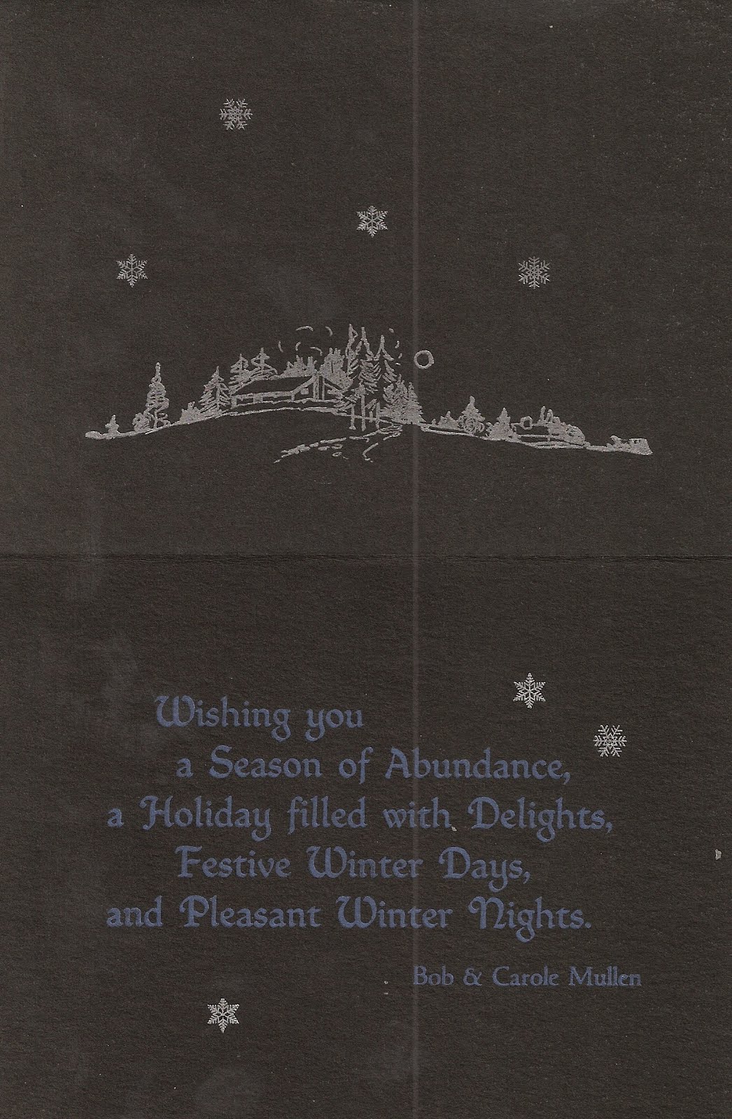 A Christmas card using Freehand, a versatile pen-lettering typeface.
With uncials, that ancient medieval letterform, my favorite is Worrell Uncial. Though we only have it in 12 point, we use it often.
 A prop card using Worrell Uncial to print "A Private Press Dedicated to Printing for Pleasure, Self-Expression, and the Preservation of Letterpress Printing History".
Choose one favorite antique type − impossible! They’re as individual and eccentric as a ninety year old maiden aunt. But if I had to choose, candidates for me would include Scribner, Art Gothic, and Atlanta.
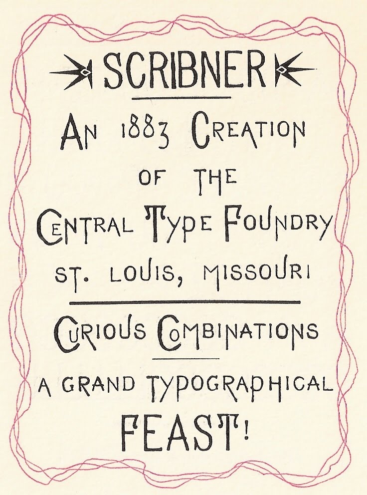 Scribner, an eccentric typeface from the Central Type Foundry of St. Louis, is fun to play with.
Some types I lust for include Goudy Mediaeval, Civilite, and anything unusual or antique. Type lust, I must confess, is a disease. You know you’ve got it when you find yourself drooling over fonts and specimen books.
Is there any type I don’t like? Yes. Brush. It’s thick, clunky, and often badly used. Brush sets my teeth on edge. Thankfully we no longer own any.
So ... what’s your favorite typeface?


