First, a disclaimer – many printers are more skilled at design than I am! Everyone has their own style, too -- often I can pick out pieces by a certain printer. Some printers love borders, others cuts. Some work with color or pattern, others with type alone. Some fill their pieces to the brim, while others print sparely. And each printer prints differently depending on the material and the occasion.
That said, it’s interesting to look at how a printed piece comes together, as least for me. Initially, there’s the idea. What do I want to print? Sounds simple, but it can be hard. I can spend a lot of time trying to find just the right quote, poem, or article.
Once I have an idea, I think about the size and shape of paper that would work best for that project. Sometimes that’s already decided if the piece is part of a cooperative booklet or calendar. Otherwise, the project determines the size and configuration. Flat or folded? Single or multiple pages? Large or small? Horizontal or vertical? At this point everything’s an option.
Next, I look for type and decorative material to express the feeling of the piece. I use our Poco press to proof cuts, border, initials, and lines of type. Everything needs to harmonize, to work together. Ideally the typefaces are from close to the same era, and of a similar weight. Likewise, cuts, border, or initials need to blend in.
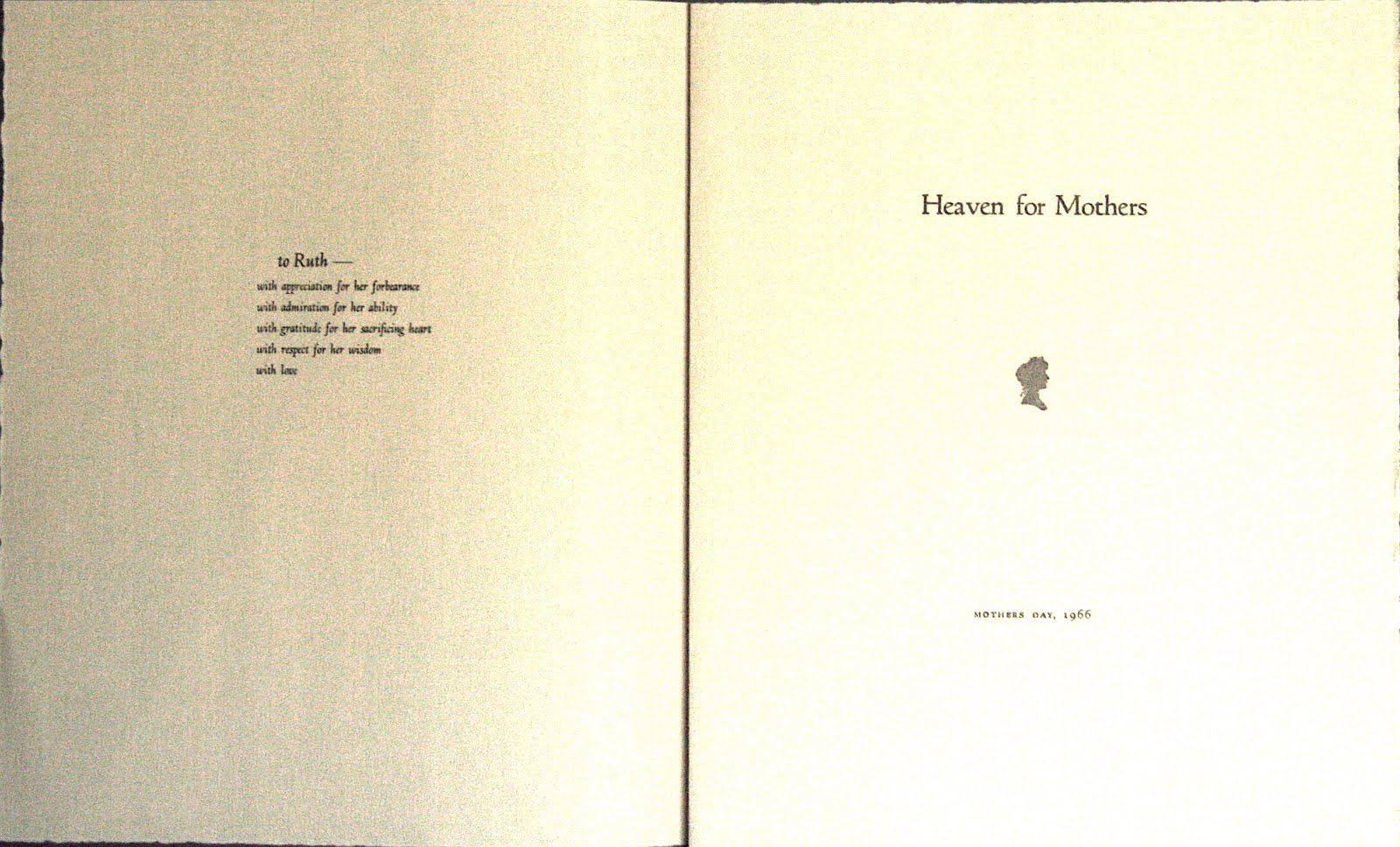
I proof the type and cuts, cut up the proofs, and arrange and rearrange elements on paper the size of my piece. No, not right. Try this size of type or this cut instead. More space between this line and that. Maybe the initial needs to be higher. It’s an instinctive, eyeball-it process. I know I’ve got it right when the whole thing looks good to me in plain black.
Once the piece comes together, more decisions need to be made. I choose my paper. And if I’m using color, I decide which colors where. Sometimes that’s simple. Other times I try several different color schemes, rolling out various inks on pieces of glass, making proofs, and cutting them up.
I’m fortunate that throughout this entire process I have access to the advice of another printer -- my husband Bob. Usually one of us takes the lead, then asks the other’s opinion, though sometimes we design a piece together.
It’s hard to come up with guidelines for designing a printed piece because every piece is different. There are basics I tend to follow though. Sometimes I break my own rules, but I follow them most of the time:
1) I try to keep the piece simple, rather than over-ornamenting things.
2) I generally match time period, weight, and style of the type and ornaments – the exception being an eclectic Victorian-style piece with different type on every line.
3) I make sure it looks good in black before adding color.
4) I keep tweaking until I get the look I want.
For me, designing a printed piece is a process of self-expression. Take the exact same idea and no two printers will print it the same way. And to me that’s part of the joy of it!

An example of choosing the quote to suit the typeface: Rustica resembles the handwriting of early scribes close to the time when Marcus Aurelius was emperor.

This memorial for my mother is printed in Murray Hill, her favorite typeface, with a border of flowers and musical notes, two of her favorite things.

A New Year's card using layers of color. My husband and I proofed several different color combinations to find the one we liked best.

One color can be just right for the occasion. This Xmas card uses a variety of old typefaces and borders in the "Victorian clutter" format.

Keeping it simple works, too. Here an interesting typeface (Parsons) takes center stage.