Showing posts with label Amalgamated Printers Association. Show all posts

Friday, March 22, 2013

Font Frenzy


“Font” is a chameleon of a word – its meaning can change depending on who’s using it. When computer users or graphic designers talk about fonts, they’re referring to different styles of type, or typefaces. Font software packages featuring many kinds of type are available online or at any computer store.

When a letterpress printer talks about a font though, they’re referring to a complete set of all the necessary metal or wood characters in a typeface (letters, numbers, punctuation, or special characters). The number of each character in a printer’s font is based on frequency of use. In other words, there are lots more e’s than there are q’s .

A member of our letterpress printing group created a piece that captures a letterpress printer’s idea of “font” perfectly:


To illustrate the point further: a computer user can easily type, “The queen quickly and quietly quaffed a quart of quince juice.” Not that this is a likely sentence, but it shows there are no limits to the number of times a single character can be used in a computer font. A graphic designer can very easily type a character, “qqqqqqqqqqqqqqqqqqqqqqqqqqqqqqqqqqqqqqqqqq” in any font they choose. In other words, the computer will generate an infinite number of any desired character.

Not so for the letterpress printer. Because handset letterpress involves putting actual pieces of metal or wood type into a composing stick to form words and sentences, there are only so many q’s. And so many A’s, a’s, and 1’s. That’s how handset typefaces are sold.


Typefaces are cast according to a font scheme. A good illustration of this is on the website of Skyline Type Foundry, a marvelous place to check out and drool over letterpress typefaces by the way. A diagram of Font Schemes explains how many of each character come with any font of type.

For a more vivid illustration: here’s what one font of Grimaldi, a charming old type face which we recently purchased from Skyline, looks like. You can see the varying numbers of each character in this 5-A, 10-a, 5-1 font of type.


Some letterpress fonts are larger and some are smaller, but they always have certain numbers of each character in them when they’re purchased new. When fonts are older or secondhand though, some pieces of type may have been mislaid.

Or in the instance of the very old 4 Line Pica Ornamented type below, some characters may be hard to use. Take a closer look at the two U's. Both are sunken due to a long ago flaw in casting. That means if you print a word with a U in it, you will have to work hard to get a decent impression.


My husband Bob and I recently experienced a practical lesson in the meaning of font. We purchased a secondhand font of Civilite jumbled in a case. I’ve long admired Civilite, and was thrilled to finally add it to our printshop. But when we sorted out the type, there was one capital A, no capital C, and worst of all, no lower case i’s. What can you write without lower case i? Not even a type case label for Civilite. Our font of type was pretty much useless.

Happily, my husband went onto the chat room of our printer’s group Amalgamated Printer’s Association and asked if anyone could spare a few characters. Two kind printers responded and offered to send the missing letters to us. With these “sorts”, as printers call small quantities of individual letters, we no longer had to be “out of sorts”. I’m not just making a bad pun here (though I am) -- that’s where that expression originated.

Now we can finally use our font of Civilite. And create a nice type case label. No more font frenzy for us – hooray!

Wednesday, May 4, 2011

Letterpress for Mother's Day


Though not a printer herself, my mother Ruth was always a big supporter of letterpress. She had an eye for good design, too. Often my father Gary Hantke would have her proofread and take a look at a piece he was about to print. Mom would catch the typos and suggest a bit of white space here or there.

Mom became good friends with several of the printer’s wives, and enjoyed attending Dad’s annual APA printing conventions. Often she managed to charm free cuts, paper, or ink from vendors at the swap meets. Mom and Dad even took a month long trip to Europe with one of the couples from APA.


She was also a wonderful mother. My sister and I never lacked for attention. She sewed our Halloween costumes, Easter and Christmas dresses, and spring and fall wardrobes. She loved to garden and play the piano, and was an excellent cook whose homemade bread, coffeecakes and pizza were legend.

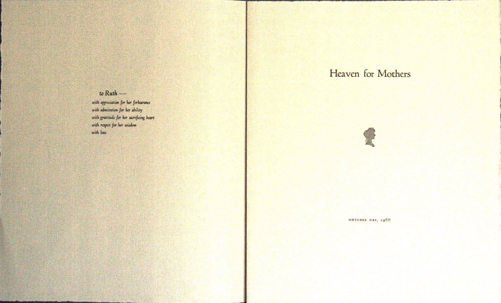
In 1966 Dad printed a lovely poetry booklet for Mother’s Day and gave it to her. All that setting and design work, and he just printed one copy ― for her. I found it with some of her papers after she died.


After my mother’s death in 2008, my husband and I printed a memorial piece in her honor. The type was Murray Hill, her favorite typeface, and the quote was surrounded by a border of flowers and musical notes.


I miss you, Mom! Thank you for all you taught me and gave me. And Happy Mother’s Day. Love, Carole

Wednesday, March 23, 2011

Printing for Treasure Gems


Treasure Gems, a bound 4 ½ by 6 yearbook of printing contributions by members of the Amalgamated Printers Association (APA) began in 1971, the same year I joined the group. It took me a little while to get going though – my first Treasure Gems piece was a quote from Emerson printed in 1978:


Over the years my husband and I have printed several times for Treasure Gems. It’s a great opportunity to showcase printed pieces. And since people collect and save Treasure Gems booklets, it’s one way to insure that your printing will be preserved and appreciated for many years!

Some of our Treasure Gems pieces have been historical, illustrating the use of a particular typeface. For example, the “Murder She Wrote” piece below talks about Art Gothic, an 1884 typeface that was also used for titling on the former television program.


We’ve done Treasure Gems pieces that show off border, too. Two below are for Acme Border, an early 20th century geometric from the Inland Type Foundry; and for Floriated Border, an eccentric 1890 concoction of flowers, twigs, and bark, designed by the Central Type Foundry.


One of our Treasure Gems pieces used an article from an old printing magazine. "Odor of a Printshop" talked about how printers get attached to the smell of kerosene, oil, and ink. They say printing gets in your blood, but in this case it gets in your nostrils!


Sometimes we've gotten whimsical, too. “American Types” was a poem published in a 1912 printing bulletin by American Type Founders, a typecasting company. Designed to be sung to the tune of “America the Beautiful”, the poem’s multiple verses celebrated ATF’s product ― a sneaky way to advertise. We thought it was kind of fun to sing the song, despite its occasionally clunky rhymes.


On the serious side, when a printer friend of ours died suddenly, we printed “Promise to a Printer” as a memorial piece. My husband wrote a “printerly” poem and we published it in memory of our friend.


Humorous or serious, historical or not, Treasure Gems contains some of the best printing from the Amalgamated Printers Association, the letterpress group I joined 40 years ago. And what a joy to work with other printers to create a booklet that will continue to be read and enjoyed years later!

Wednesday, March 9, 2011

Xanadu Press: Then and Now


Xanadu Press, my husband’s and my private press, was founded in 1971. Then single and still living at home, I attended the St. Louis APA Wayzgoose with my family. I’d been interested in printing for some time, and had spent a lot of time helping my father in his print shop. So when an opening came up in the Amalgamated Printers Association, I didn’t hesitate. I was excited and started to print right away. My first project was a proprietor’s card, or “prop card” for my new press (see above).

I’d always loved the poem “Kubla Khan” by Samuel Taylor Coleridge, which begins, “In Xanadu did Kubla Khan a stately pleasure dome decree...” So I named my press The Xanadu Press. By the way, Xanadu Press has nothing to do with that disco roller skating movie that came out in 1980!

My first printing efforts were modest. I printed a bookplate with a quote from William Blake. I did a holiday card, and a few Ben Franklin quotes. Then I decided to put together a small booklet of my poetry and call it Xanadu.


After our marriage my husband became interested in printing, too. My father Gary Hantke continued as a mentor to us both. Initially we lived in the same town and close to my father’s print shop, with its wealth of type, borders, and ornaments. But after we began moving in conjunction with our teaching careers, we acquired a 5x8 Kelsey hand press and a few type fonts of our own in the interest of portability.

It was then that we began to understand how difficult printing can be without the right equipment. We struggled with our little Kelsey press, trying to get a decent impression. Our main types were Cheltenham Bold and a little battered Caslon. It was hard to print something nice with so little variety.

We did create a small booklet called The Little Book of Steamboat Puns. It was notable mainly for the dreadful puns we came up with (for example: What do you call a 2000 pound steamboat thief? Robber Full-ton). In a fit of printerly pride, we gave a copy to the late musician and river enthusiast John Hartford at one of his concerts. He was very gracious, and actually remembered the booklet when we talked to him at a performance 15 years later. Maybe it was the awful puns that were memorable!


In the early 1980s we acquired a 7x11 Pearl press, hauling it in our AMC Pacer through a driving rainstorm in Philadelphia and back to our Wisconsin home. Now it was a little easier to print, especially since we’d bought more type from a printer in Lake Mills, Wisconsin. Living on the outskirts of a tiny village on the Mississippi River we were virtually rural, with a huge garden and beehives. We printed labels to sell jelly and honey at local farmer’s markets.


After our move to St. Louis in 1987, we became more active printers through our involvement with the St. Louis Letterpress Society and the APA. Following Dad’s death in 1990, we hauled most of his shop down to St. Louis in an exhausting move we’ll never forget (but more on that in a future blog!) We began printing items for our new St. Louis interests, some of which are shown below: a steamboat museum’s 50th anniversary program; a button for my husband’s museum co-workers after an exhibit installation; and a piece promoting the first of three APA Wayzgoose conventions in St. Louis.


Today we print more than we did in our earlier years. The lure of the print shop seems greater every year, with many projects to excite us. As Xanadu Press marks its 40th anniversary this summer, I’m grateful for all those printing opportunities, now and in the future.

Wednesday, January 5, 2011

Salute to the Mailer!


As members of the Amalgamated Printers Association, one of the things my husband and I look forward to most is the bundle. This collection of letterpress pieces by members is mailed out to everyone in the organization monthly. To me, getting the bundle is better than opening a box of chocolates! You get to see what everybody’s been printing. You could say the bundle is the lifeblood of APA — it’s what keeps everything circulating from one printer to another.

Instrumental in getting the bundle out is the mailer. Whoever has the job receives all the printed pieces from members, then sorts and distributes them through the monthly mailings. It’s a big job! I know because I’ve worked with it twice. My father Gary Hantke was mailer a couple of times (for part of 1960, and again in 1973 and 1974). And my husband Bob and I were mailers in 2001 and 2002.

My sister and I learned the meaning of the word “collate” early, when Dad was mailer. Printed pieces were lined up on the kitchen table. Round and round we’d go, picking up one of each and adding it to the bundle envelope. Sometimes my sister and I would race, but Dad discouraged that because of the dreaded “double pick”— if you got careless and picked up more than one, that item could run out before you finished all the bundles. Then you had to search to see where you’d made the mistake. Helping Dad with the bundle was fun for me, though. I liked looking at all the printed pieces. Sometimes there were extra copies, and I got to have my own little bundle made up of the leftovers.

With positive childhood experiences compiling the bundle, no wonder I was agreeable when my husband and I were asked about taking on the mailer’s job. We tried to plan ahead as much as possible. We bought a big covered plastic bin to shelter incoming packages from the weather. We set up a hanging file folder system to gather pieces two or three times during the month before stuffing bundle envelopes. We thought we were set to go. But our tenure as APA mailers started out with a challenge and a half.

The January 2001 bundle, our first as mailers, was HUGE! The combination of holiday pieces intended for the December bundle and a Benjamin Franklin theme (in honor of Ben’s January 17th birthday) swelled the bundle to immense proportions. We gathered pieces, and gathered and gathered some more. The question was how to fit it all into the specially printed envelope with Ben on the front. Finally with careful layering, we got it all in. There wasn’t room for a scrap more! I’m sure very few people put their bundle pieces back into that January 2001 envelope after looking at them — once removed they sprang out and refused to go back in. It was quite the introduction to being mailers. Thankfully, no other bundle while we were mailers was as big as that first one!

According to APA’s website, over the club’s history 860+ people have been members, but only 23 people have been mailers. And without the mailer, APA wouldn’t be where it is today. So here’s a big salute to our 2009-2010 mailer Don Tucker, all of our former mailers, and to incoming mailers Ky and Sara Wrzesinski for taking on the job. You’ve truly made a difference — thank you!

Wednesday, October 20, 2010

Lillian Worley, Printer and Friend


One of the most delightful people I met through my dad’s involvement in letterpress was Lillian Worley. A letterpress printer with a passion for cuts, Lil had a contagious sense of fun. I first met her and her husband Parker, both printers, at the 1964 Munster Indiana Wayzgoose. It was Munster where she taught my sister and me how to spit watermelon seeds as we devoured melon from a nearby produce stand.

A year later at the 1965 Lansing Michigan Wayzgoose, Lillian had printed “Print Pox” signs. Designed to look like a quarantine sign, “Print Pox” was a tongue-in-cheek warning about contagious letterpress addiction. Lil enlisted my sister and me to help her hang signs on the doors of the strip motel where the convention was taking place. Giggling, the three of us sneaked around taping “Print Pox” signs on all rooms where the printers were staying.

Lillian loved cuts, especially large or unusual ones. I remember one Wayzgoose where she bought an enormous cut of the Statue of Liberty. The thing must have been 8x15 inches or larger. Everybody teased Lil that she’d never use it. But she sent a big folded piece through the APA bundle a few months later, decorated with that Statue of Liberty cut.

Lillian often wrote and printed humorous pieces. Below is an example, an honorary “degree” printed for me from the fictitious Deuceace University, and a reference to it in a Christmas card that same year. Notice that the “official seal” is from the Clearfield Wrecking Company!


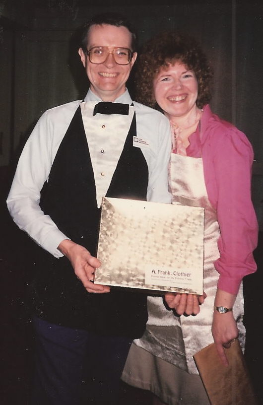
After my husband and I joined the APA together, Lillian presented us with dress printers' aprons. Bob's looked like a tuxedo, and mine was white satin. The hand printed label on the box said, "A. Frank, Clothier" -- a reference to printing warehouse dealer Al Frank.


In the early 1990s my husband and I visited Lillian and Parker in their Haddonfield, New Jersey home. We had a great time seeing their elegant carpeted press room, and taking an excursion to nearby Cape May. On that trip we hauled home in the back of our yellow AMC Pacer a 7x11 Pearl press they found for us. Despite the care the four of us took loading it, the weight of the press threw the car’s steering off. A torrential rainstorm on the freeway through Philadelphia made driving even harder, but we did get that press home and were grateful to have it.


Lillian was one of the earlier female printers in the Amalgamated Printers Association. At a time when most wives went shopping while the printers talked type, Lil hung out with the printers. She didn’t hesitate to paw through dusty offerings at Al Frank’s warehouse, to bid hard on auction items, or to hunt for bargains at the swap meet. She was an inspiration to me in that way, making it acceptable for me to be a girl and interested in printing.

I can’t imagine where I’d be today without Lillian Worley. I was a serious child, and she taught me how to laugh. She was a role model for me as a printer, and an absolute joy to know. Anyone who ever met her would never forget her. How lucky I was to have known her for so many years!

Wednesday, October 6, 2010

Printer's Knickknacks


Normally I’m not a fan of knickknacks that sit on a shelf and gather dust. But printer’s knickknacks are an entirely different thing. My husband and I have a small collection of whatnot items in our print shop that help to make the shop our own. True, they do gather dust, but....

Benjamin Franklin, that much admired printer and founding father, has a prominent place in our printing knickknack collection. We have a small bust of him, and a Ben Franklin “action figure” holding a kite with a key. We would rather have Ben holding a composing stick, but oh well. He has a miniature type case, but the compartments aren’t the right size – too even. To compensate we display “action figure Ben” next to a miniature common press which my dad got as a souvenir from the Gutenberg Museum in Mainz. Close by is a picture of my husband with Ben Franklin’s original press – the press was featured in an exhibit on Franklin at the museum where Bob works.

On the same shelf are pieces of type with jets that we cast; a Babcock Press paperweight; a miniature printing office, the “Liberty Falls Daily News”; Wayzgoose souvenirs, buttons, badges, and a typewriter ball; and in a small box, an 8 point piece of type with the entire Lord’s Prayer on it. This “Lord’s Prayer on a piece of type” was a promotional giveaway from American Type Founders, a huge American type founding firm. The words are actually legible under a strong magnifying glass.

Not to be forgotten are the pictures. We have a framed shot of my father Gary Hantke at the 1984 Wayzgoose in La Crosse, Wisconsin. Dad was in his glory there, having finally lured the Amalgamated Printers Association convention to our hometown. Wearing his APA cap and a shirt with reproductions from the MacKellar, Smiths, and Jordan specimen book, he beams out at us. Next to the picture of Dad, there’s a picture of my husband and myself at the 1994 Wayne, Michigan Wayzgoose, and a little trophy labeled “Famous Printer”, which of course we have to display.


Probably my favorite printer’s knickknack is one sewn by my mother and embellished by my dad: a printer’s doll, Cabbage Patch style. During the height of the Cabbage Patch craze, my parents produced 2 or 3 of these “printer’s dolls” for sale at a Wayzgoose. My mom sewed and stuffed the doll to look like a stocky guy with questionable fashion taste, adding checked pants, a polyester shirt, a visor and a printer’s apron. My dad created a miniature composing stick and line gauge for the doll, and printed “I Like to Print” on the apron. Needless to say, we are not parting with this particular knickknack soon.


Most of the stuff in our print shop is highly functional. But our printer’s knickknacks add a unique touch, showing who we are and where we’ve been. Personally, I couldn’t do without them!


One more knickknack, actually functional but too small to use much -- a miniature press. The platen on this one is 2 1/2 by 4 inches.

Wednesday, September 15, 2010

The Schori Press


One of the most interesting and delightful people I met as a child through my father’s association with letterpress was Ward Schori. Ward and his wife Marty lived in Evanston, Illinois when I first met them in the early 1960s. Ward ran a commercial printing business there called The Schori Press, but was also an enthusiastic letterpress hobbyist.

Enthusiasm was a defining term for Ward. He loved letterpress printing in its every aspect: designing and printing books, booklets, and ephemera; acquiring new type and cuts; and talking with others about printing.

Ward loved to talk, and he talked with his hands. I vividly remember riding in Ward’s car as he drove the freeways of Chicago, periodically taking his hands off the wheel to emphasize a point as he talked with my dad in the front seat. The mixture of enjoyment of Ward’s stories and absolute terror at the way he drove is something that will always stick with me. If the hands-free driving got a little too scary, Marty would gently chide him, “Now Ward, pay attention to the road.” That would last about five minutes, then Ward would be talking with his hands again.

Marty herself was a delight to know. An elegant woman with white hair in a French twist, she had a beautiful smile and a hearty laugh. I loved her wink, which she’d send my way every now and then. By the time I met them, Ward and Marty were grandparents. They raised their two grandchildren, who were about the same age as my sister and myself.


Together with my father Gary Hantke and his printing friend Emerson Wulling, Ward was a key organizer of the 1st Amalgamated Printers Association Wayzgoose in 1961. In those days the host provided food for the convention’s “picnic” that took place on Sunday. So Ward roasted a big turkey on his barbeque grill while Marty made side dishes, beverages, and dessert for all the printers in attendance.

At my first Wayzgoose in 1964 in Munster, Indiana, Ward encouraged me to enter the typesetting contest on the lawn in front of the motel. A case of type was set up on the tailgate of someone’s station wagon, and printers were timed as they set copy by hand, one letter and one space at a time. I was pretty young yet so I didn’t end up entering the contest, but I felt proud that Ward had believed in me.

In addition to regular sized books (he printed several), Ward became well known for his letterpress printed miniatures. He created over fifty of these intricate books, including some bound in hand-tooled leather from Spain. My husband and I are happy to have half a dozen Schori Press miniatures on our bookshelf today.

Part of the joy of being a hobby letterpress printer is getting to know other hobby letterpress printers. Ward and Marty Schori certainly stand out in my memory as two people I met through letterpress that I was privileged to know.

Title page of The Fortsas Bibliohoax, a private press book published by Ward Schori in 1986.

Six Schori Press miniature books and the full sized book "Printshop Nostalgia", all printed by Ward.


With the Schoris at the 1991 Wayzgoose in St. Louis, as we board the excursion boat "Belle of St. Louis". From left to right, Ward Schori, my husband Bob, Marty Schori, me, and my mother Ruth Hantke. Dad has just passed away the previous year.

Wednesday, August 4, 2010

Chuckwagon Charlie and His Missus

A visit to the Duerrs' home on Myrtle Avenue in Elmhurst, June 1962: from left to right, my mother, my sister, me, my dad, and Emerson Duerr.


From left to right, my mother, my sister, Blanche Duerr, me, and my dad. This time Emerson took the picture.


Two wonderful people I remember from my childhood in the Amalgamated Printers Association were Emerson Duerr (APA 273), who often called himself “Chuckwagon Charlie” in print, and his spirited wife Blanche. I met the Duerrs about 1960, when my dad was making frequent trips to Chicago to visit rare book libraries and printer friends.

Emerson Duerr ‘s main press was a huge Golding Art Jobber with a balky fountain that gave him fits. His favorite cut was an electro of a Civil War era woman with a train in the background, which my dad dubbed, “The Lady and the Locomotive.” He used it on most of his printing.

Emerson Duerr had a dry sense of humor in person and in his writing. His dead-on W.C. Fields imitation would make my sister and I giggle every time. He was a lawyer, but his field could have been comedy writing. My entire family looked forward to his letters. He deliberately exaggerated and misspelled words, signing himself, “Yore ole frend”, and talking about himself and “his missus” as he called Blanche.

Here’s an example of his writing, from a cooperative piece printed during a 1968 visit to our home in La Crosse, Wisconsin. In it he talks tongue in cheek about APA bundle submissions:
“Some of our members would be better craftsmen if they were acquainted with the interior arrangement of Mr. Webster’s word garage and its most effective use. It was suggested we hire Mr. Webster on a per diem and mileage basis to visit our members and properly orient them. This was ruled out because Noah Webster died in 1843 and is no longer available for such employment.
Then it was suggested that our Mailer, who is a college instructor, be authorized to exclude from the bundle any contribution containing a misteak in spelling. This was loudly hooted down as an invasion of the freedom of speech.
But what shall we do about members who think erroneously that they are ‘hobbiests’? Professor Wulling, an authority on words, concedes that an amateur printer is a hobbyist, but it is possible that this ‘hobbiest’ business is an effort to distinguish between degrees of amateurism. Thus, ‘You are a hobby printer, but I am a hobbier printer, and he is the hobbiest printer of us all.’”

Emerson’s wife Blanche was a lively grandmotherly type, spunky and full of fun. Her stories and home cooking made it a treat to visit her and Emerson in Elmhurst. Blanche looked like a sedate older woman, but she was not to be outdone. I remember when my family was riding with her and a teenager pulled up next to her at a stop sign in Elmhurst. He revved his engine, and yelled, “Want to race, grandma?” The daughter of an auto dealer, Blanche knew cars. She warned us all to hang on. When the light turned green, she floor boarded her big Buick, leaving her challenger far behind.

Emerson Duerr was in his sixties when we met him, and already suffering from a heart condition. After his death in 1972, my father and his frequent printing collaborator Emerson Wulling produced a memorial booklet in his honor entitled “Yore Ole Frend, CWC”. I helped with the booklet, shown below.

One of the joys of printing is meeting other people who print. I’m so glad I had the opportunity to know “Chuckwagon Charlie and His Missus” – two outstanding human beings.


Cooperative piece printed during the Duerrs' visit to our home in La Crosse, Wisconsin, August 1968.


Memorial booklet for Emerson Duerr, produced by Gary Hantke and Emerson Wulling. "The Lady and the Locomotive" cut is featured.