Showing posts with label St. Louis. Show all posts

Tuesday, March 20, 2012

River Rat Printers


My husband and I have spent most of our lives along the Mississippi River, appreciating both old time letterpress printing and the romance of the steamboat era. We began in La Crosse, Wisconsin, moved downriver to Lynxville, Wisconsin, then to St. Louis, Missouri. We’ve learned that our twin interests are more linked than you might imagine: newspaper printing was the mass media of the 19th century, and riverboats a major form of transportation. The Mississippi was like a super highway in those days, and printers depended on it to deliver presses, type, and paper, and distribute news up and down the river.


As printers interested in history, we’ve done quite a few pieces relating to riverboats. Our first was “A Little Book of Steamboat Puns”, a small booklet of atrocious river puns we made up ourselves. Though the puns were bad, the booklet was nice. We gave a copy to the late John Hartford, musician and river lover, at one of his performances. Years later we met him again, and he actually remembered our booklet. Maybe it was because the puns were so awful.


While in St. Louis we became volunteers at the Golden Eagle River Museum, and got to use our riverboat cuts some more. We printed programs, name badges, and bookmarks for the group.


We also added to our riverboat cut collection through the generosity of Golden Eagle members. Irv Braun had worked for transportation printer Con Curran, and saved many railroad and riverboat cuts from oblivion when the company switched from letterpress to offset. And James Swift, known to everybody as Jimmy, was a writer and historian for the Waterways Journal, a St. Louis based river magazine. Jimmy bequeathed his collection of river cuts to us. Some of our cuts from Irv and Jimmy are shown below.


While in St. Louis, we actually had the opportunity to print on a steamboat. The Bibliographical Society of America hosted a Mississippi River cruise at its 2004 meeting. Bob and I hauled a Baltimorean table top press, paper, and supplies over uneven riverfront cobblestones and onto the boat, where we were offered a small, wobbly table to set up. We wondered if any of the attendees from major libraries and rare book rooms would want to bother printing our little bookmark. To our surprise, we had a long line. People were thrilled to have the opportunity to print something themselves.


Years later we once again find ourselves printing along the Mississippi River, this time back in our hometown of La Crosse. We’ve come full circle, and we wonder what links between letterpress printing and the river we’ll discover this time around!

Wednesday, April 13, 2011

I Love Cuts: Planes, Trains, Boats, and Automobiles


Some of my favorite printer’s cuts relate to transportation ― by locomotive, biplane, steamboat, clipper ship, Model T Ford, hot air balloon, or even horse-drawn hearse! Most of these vehicles are dated since printer’s cuts aren’t a 21st century item, but that’s part of their charm. No cuts of supersonic jets, bullet trains, or space shuttles exist as far as I know, but that’s okay. I’m perfectly content to stick with the old stuff!

Letterpress cuts of old cars can be light-hearted and humorous, as the pictures above and below show. It’s a world few people remember first-hand, when the automobile was a novelty, and driving on dirt roads either an adventure or an exercise in frustration. And then there are the logos for old cars you can’t buy anymore ― Auburn, Durant, Packard, Studebaker, and Nash ― all collectible and fun to play with.


I’ve written about train logos before, but didn’t get a chance to show any cuts of the trains themselves. Many of these were given to us by a friend who was a former employee of Con Curran, a St. Louis firm that printed for railroads.


Boats are another area of cuts to explore, and we especially enjoy them since my husband is a steamboat enthusiast. We were fortunate enough to receive a collection of steamboat cuts through our good friend Jimmy Swift who wrote for the Waterways Journal, a St Louis river-based magazine. We met Jimmy volunteering for the former Golden Eagle River Museum (see badge below). Jimmy Swift was a wonderful historian and writer who truly loved the river. In his will he provided a free memorial river cruise for his friends, complete with dinner and old-time banjo music. We printed a memorial piece for that cruise, featuring some of the riverboat cuts Jimmy had given us.


Cuts of planes, trains, boats, and automobiles ― souvenirs of the past, and fascinating mementos to collect. One of our cut drawers below shows a few more kinds of transportation. How many can you spot?

Wednesday, March 9, 2011

Xanadu Press: Then and Now


Xanadu Press, my husband’s and my private press, was founded in 1971. Then single and still living at home, I attended the St. Louis APA Wayzgoose with my family. I’d been interested in printing for some time, and had spent a lot of time helping my father in his print shop. So when an opening came up in the Amalgamated Printers Association, I didn’t hesitate. I was excited and started to print right away. My first project was a proprietor’s card, or “prop card” for my new press (see above).

I’d always loved the poem “Kubla Khan” by Samuel Taylor Coleridge, which begins, “In Xanadu did Kubla Khan a stately pleasure dome decree...” So I named my press The Xanadu Press. By the way, Xanadu Press has nothing to do with that disco roller skating movie that came out in 1980!

My first printing efforts were modest. I printed a bookplate with a quote from William Blake. I did a holiday card, and a few Ben Franklin quotes. Then I decided to put together a small booklet of my poetry and call it Xanadu.


After our marriage my husband became interested in printing, too. My father Gary Hantke continued as a mentor to us both. Initially we lived in the same town and close to my father’s print shop, with its wealth of type, borders, and ornaments. But after we began moving in conjunction with our teaching careers, we acquired a 5x8 Kelsey hand press and a few type fonts of our own in the interest of portability.

It was then that we began to understand how difficult printing can be without the right equipment. We struggled with our little Kelsey press, trying to get a decent impression. Our main types were Cheltenham Bold and a little battered Caslon. It was hard to print something nice with so little variety.

We did create a small booklet called The Little Book of Steamboat Puns. It was notable mainly for the dreadful puns we came up with (for example: What do you call a 2000 pound steamboat thief? Robber Full-ton). In a fit of printerly pride, we gave a copy to the late musician and river enthusiast John Hartford at one of his concerts. He was very gracious, and actually remembered the booklet when we talked to him at a performance 15 years later. Maybe it was the awful puns that were memorable!


In the early 1980s we acquired a 7x11 Pearl press, hauling it in our AMC Pacer through a driving rainstorm in Philadelphia and back to our Wisconsin home. Now it was a little easier to print, especially since we’d bought more type from a printer in Lake Mills, Wisconsin. Living on the outskirts of a tiny village on the Mississippi River we were virtually rural, with a huge garden and beehives. We printed labels to sell jelly and honey at local farmer’s markets.


After our move to St. Louis in 1987, we became more active printers through our involvement with the St. Louis Letterpress Society and the APA. Following Dad’s death in 1990, we hauled most of his shop down to St. Louis in an exhausting move we’ll never forget (but more on that in a future blog!) We began printing items for our new St. Louis interests, some of which are shown below: a steamboat museum’s 50th anniversary program; a button for my husband’s museum co-workers after an exhibit installation; and a piece promoting the first of three APA Wayzgoose conventions in St. Louis.


Today we print more than we did in our earlier years. The lure of the print shop seems greater every year, with many projects to excite us. As Xanadu Press marks its 40th anniversary this summer, I’m grateful for all those printing opportunities, now and in the future.

Wednesday, December 8, 2010

I Love Cuts: Railroad Cuts and Logos


I’ve always enjoyed trains — as a kid I grew up within a few blocks of where the Burlington Northern ran through my hometown. My sister and I made games of counting freight cars and seeing how many different kinds we could spot. We watched spinning train wheels until we were dizzy. And once we spotted a hobo, riding in style in a new car that was travelling by train to some auto dealer’s lot. We waved, and the hobo waved back to us. I love the sounds trains make, too – the whistles, the clack of the wheels, and that oddly fading sound (Doppler effect) as they pass by. So naturally as a printer, I love railroad printing cuts.

Our railroad cut collection got a big boost in the mid-1990’s. We hosted a meeting of the St. Louis Letterpress Society in our home, and one of our friends who attended said he had some cuts to give us. Irv was a former employee of Con P. Curran, a St. Louis firm that specialized in railroad printing. Con Curran advertised themselves as “the railroad printers”. Their offices, dating from 1893, were once located at 3rd and Locust in downtown St. Louis, in the area now occupied by the Gateway Arch. When the letterpress shop of Con Curran was broken up years ago, Irv was able to save railroad cuts and logos that otherwise would have been trashed.

Printers' cut of the old Con P. Curran office building at 3rd and Locust in downtown St. Louis circa 1893.


When we saw what he’d saved, we were amazed and grateful for his gift. There were cuts and logos from many different railroad lines — Detroit, Toledo and Ironton, Western Pacific, Rio Grande, Cotton Belt Route, Colorado and Southern, Frisco, Santa Fe, Burlington, Katy, Florida East Coast, D and W, Milwaukee Road, New York Central, Wabash, and Mobile and Ohio, to name a few. There were cuts of hand signals for trains, and cuts of the trains themselves. And there were cuts of the old Con Curran office building. It was a treasure trove for us.

Below are pictures of some of our railroad cuts. It’s fascinating to me to see what logos were used by what railroad lines. And for some of the old railroad lines long since defunct, these cuts are a memento of a time when much of the country traveled by train. What a great souvenir of our railroading past!


.

Wednesday, November 3, 2010

Stepping Back In Time


Sometimes when I tour a historic print shop, I get the feeling of stepping back in time. The place looks ready for action, with alleys of case stands and lines of presses. Type cases are pulled out, with composing sticks set on top of them. I smell the familiar odors of ink, oil, and type wash. It feels like the old printers went to lunch and will be back any minute now.

State Capital Publishing, which my husband and I toured during the 2007 Oklahoma City Wayzgoose, is now a museum. Located in Guthrie, the former capital of Oklahoma, the building dates from 1902. This was once the official printing office of Oklahoma territory and home of its main newspaper, The Capital.


The main level of the old building is museum-like, with display cases, shelves for finished printing jobs, and an old fashioned teller cage. But going downstairs into the print shop, you get the eerie feeling that the presses were running this morning. Jobs that were being printed are easy to spot as forms on top of case stands. Ink and paper sit on shelves, available at a moment’s notice. A big line of Chandler and Price platen presses and a huge cylinder press stand ready for action, with mannequins adding to the sense of their being used now. It’s like entering a time warp of about a hundred years.


Years before when the printing equipment of S.G. Adams, an old St. Louis firm, was for sale, I experienced the same thing. My husband and I took the freight elevator to the 5th floor and stepped out into a world a century old. The shop was abandoned, but looked like it was still in use. There sat the lines of case stands, newspaper turtles, racks of leads and slugs, and shelves of paper. The foreman’s office stood open, and I kept wondering if he and the other compositors would be showing up soon.


S.G. Adams building of St. Louis in its heyday.

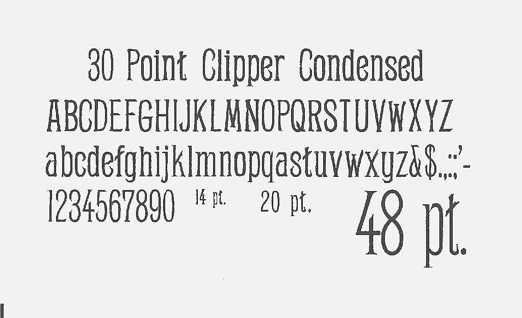
Everything was for sale at S.G. Adams, and inexpensively, too. The type cases were already sold, but all of the type was available. We had to dump the type into plastic bags, hoping the more delicate kerned fonts would survive the rough treatment. We picked up several antique faces including Clipper Condensed and Victoria Italic for fifty cents a pound, a price that made us feel like thieves. There was wood type for sale, too. We casually asked the price, thinking it would be sky high. Fifty cents a pound! It was like buying a piece of history for a song, and I hoped the old printers wouldn’t object.


Most museum print shops are of necessity surrounded by wooden gates and velvet ropes. Sometimes presses are being demonstrated, sometimes not. My husband and I study the details, standing there as tour group after tour group passes through. Often we end up chatting with the printer, and sometimes being invited behind the scenes. But that incredible “time warp” feeling comes only when we get to wander freely through an old print shop that looks like it was in use yesterday. Then we get that thrilling sensation of a step back in time into the past of letterpress – something every printer should experience at least once in a lifetime.

Wednesday, August 18, 2010

Firecracker Press: 21st Century Letterpress in St. Louis

An overview of the sales area of Firecracker Press. Printing equipment and case stands serve as display areas for letterpress items for sale.

A colorful display of posters catches the eye and shows people what letterpress looks like.

Firecracker Press proprietor Eric Woods adjusts type in a letterpress poster on the Vandercook.

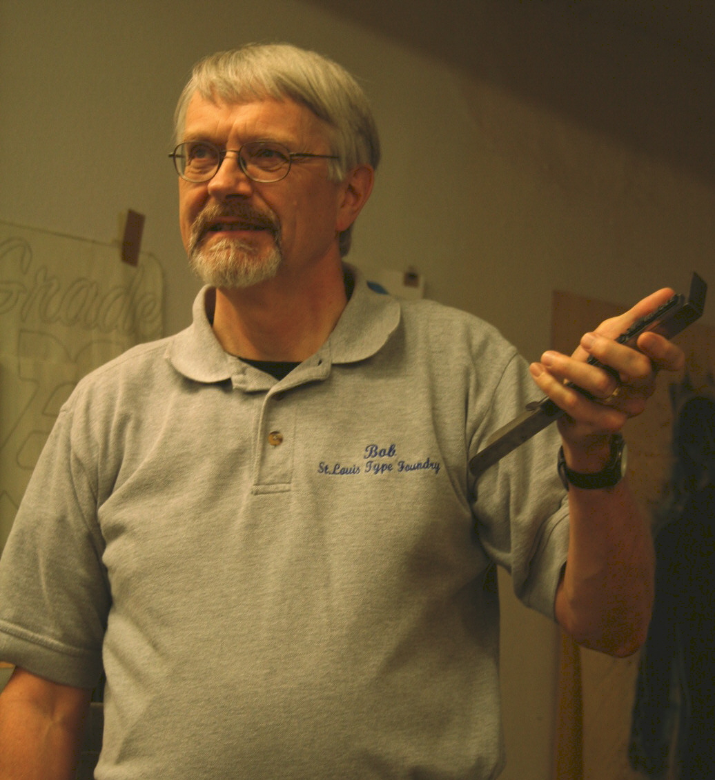
Author Bob Mullen illustrates a point in his talk on St. Louis type foundries.

Last Saturday my husband Bob gave a PowerPoint presentation at Firecracker Press, a letterpress specialty shop here in St. Louis. Bob’s talk, “Type Nerds Unite” on the history of type founding in St Louis attracted a good-sized crowd of enthusiastic young graphic designers and printers. Bob talked about the eleven type foundries that were in business in St. Louis between 1840-1925, comparing the trends in type design they showcased to overall decorative taste in each time period. Copies of his book, “Recasting A Craft” (Southern Illinois University Press – http://www.siupress.com) were available for sale. The creative energy was bouncing off the walls as the audience lined up to ask questions and get copies of their commemorative poster of the event.


Firecracker Press is a happening place. The excitement proprietor Eric Woods and his staff generate can be felt by anyone entering the shop on 2838 Cherokee Street. Colorful letterpress posters, greeting cards, journals, poetry chapbooks, buttons, and T-shirts entice you as you enter the showroom. Venture in a little further and you’ll hear the rumble of Vandercook presses and smell printer’s ink.


Creative advertising and promotion, community events series, and a strong web presence (check out http://www.firecrackerpress.com) have made Firecracker Press a highly successful letterpress business. The shop has become well known enough to be featured in the St. Louis Post-Dispatch and on St. Louis Public Radio (KWMU).

Eric and his three employees (shop manager Matty Kleinberg, Sarah Richardson, and Maggie Filla) and four seasonal interns keep incredibly busy, creating one-of-a-kind wedding invitations, business cards, poetry books, advertising for retail businesses, and specialty posters for clients like the St. Louis Science Center and Forest Park Forever. The majority of the designs are hand carved in wood, then printed in a rainbow of colors.

Hand carved wooden blocks form a background design for a Firecracker Press poster to be printed on the Mastercraft press.

Eric got hooked on letterpress at the Kansas City Art Institute while pursuing print-making and getting his degree in graphic design. He founded Firecracker Press in 2002, and after eight years is still fascinated with letterpress. “There’s something about the quality of letterpress. It a good way to combine design and printing,” he says, freely admitting that he loves both.

With an imaginative and hard-working crew, the ideas come easily. “We bounce things off each other,” he says. A look around the shop made it easy for me to see how much fun they’re having doing that.

Part of the Firecracker Press staff at the Vandercook: from right to left, shop manager Matty Kleinberg; proprietor Eric Woods; Sarah Richardson; and intern Ashford Stamper.

Firecracker Press is hosting a special series this year, including poetry readings (with the poetry printed on posters as the poets read on stage) and a chocolate tasting event that promises to be especially delicious.

Posters set and printed at Firecracker Press during a poetry reading.

Once you’re drawn into the shop, you’re hooked. You want to buy stuff. You want to play with type and cuts and get your hands inky. Your creativity quotient gets cranked up to maximum. Bravo to Eric and crew for introducing so many people in the St. Louis area to the unique quality and excitement of letterpress!

Two business cards for Firecracker Press. Notice the specially created advertising logo on top that looks like a matchbox.