Wednesday, August 25, 2010

Sumac and Willow


Dr. Emerson Wulling of the Sumac Press of La Crosse, Wisconsin must hold the record for the longest running private press in North America. He began printing when he was 11 (1915) and continued until age 101 (2005). He produced over two hundred letterpress books, pamphlets and publications in those ninety years. A close friend and mentor to my father Gary Hantke (Willow Press), he was a family friend too. I remember him from my childhood as a delightful gentleman with a quick wit, a kind heart, and a wry sense of humor.

My dad told me how he and Emerson Wulling had met. He was a freshman in Professor Wulling’s English class in 1938. Asked to write about a hobby, Dad wrote about printing. Dr. Wulling called him over after class and told him that his hobby was printing, too. That was the start of an over fifty year friendship between the two men.

Emerson Wulling usually visited on Saturday mornings. An unfailing gentleman, he would always call first. When we lived near the college he often arrived on his ancient bicycle, which he rode in slow circles before parking in front of our house. Only later did I learn that was his way to slow down because the bicycle had no brakes.

Usually Dr. Wulling brought something printing related with him when he visited -- a book, a specimen sheet, or an item he’d printed. He was my father’s mentor as well as mine. When I printed a children’s fairytale at age 8 (with lots of help from my dad), Emerson Wulling listed it in one of his publications of recently printed pieces. I was so proud.

Dad wrote about his friendship with Emerson Wulling in a printed piece called, “On Printing ... and Friends”: “I muddled along. My father made me a composing stick formed out of sheet steel, but my lines were still uncertainly justified. I acquired another quoin and a can of black ink. Then, in my freshman year at college, there came a turning point and the beginning of a friendship which still continues. My English prof was himself a hobby printer. Emerson Wulling, already a craftsman with type and press, gently guided my crude attempts and taught me to use my press properly and to appreciate printing done in good taste. His work is still today the example which I strive to emulate.”

Together Emerson Wulling and my father – Sumac and Willow − formed The Impromptu Chappel. When another printer came to visit La Crosse, Dr. Wulling and my father would print a cooperative piece. I helped out in The Impromptu Chappel, setting type, feeding the press, and enjoying the fun with the printers.

After my father’s death in 1990, Emerson Wulling was a support to my husband Bob and I as we reduced dad’s print shop to manageable size and moved it to St. Louis. On a trip to La Crosse in the late 1990‘s, we visited Dr. Wulling and his wife, and enjoyed a tour of The Sumac Press. Dr. Wulling was delighted to show us his shop, printing books, and collection of composing sticks. He was particularly pleased with a pulley arrangement his son had created to help him lift the chase into his C&P press.

We retained our friendship with Dr. Wulling through correspondence, phone calls, and holiday cards. An optimist despite increasing age, Emerson Wulling signed his letters “Good Cheer!” We delighted in his hand printed New Year’s card for 2004: “With a combined age of 193 years, we have had how many times to say HAPPY NEW YEAR? Here is another! Jean and Emerson Wulling”

Emerson Wulling passed away in 2006, an active private press printer to almost the end of his lifetime. He was a superb craftsman, creating classic, beautifully designed books and booklets. But I most remember the kind, witty, intelligent man that he was. His generosity, warmth, and enthusiasm for living made him a person truly worth knowing. I feel fortunate to have called him a friend.


Press Preterite 1 from 1945, a record of Sumac Press printed pieces for the first thirty years of the press. Wulling printed eight Press Preterites throughout his lifetime.


"Again the Kensington Stone", a 1969 booklet printed by the Sumac Press.


An article about private presses in La Crosse, Wisconsin in the 1970's mentions Gary Hantke and Emerson Wulling.


Emerson Wulling's printed piece on the double knee composing stick. Wulling was fascinated with unique composing sticks and had a large collection of them.


Ever the printer, Emerson Wulling explores his printery in his later years.

Wednesday, August 18, 2010

Firecracker Press: 21st Century Letterpress in St. Louis

An overview of the sales area of Firecracker Press. Printing equipment and case stands serve as display areas for letterpress items for sale.

A colorful display of posters catches the eye and shows people what letterpress looks like.

Firecracker Press proprietor Eric Woods adjusts type in a letterpress poster on the Vandercook.

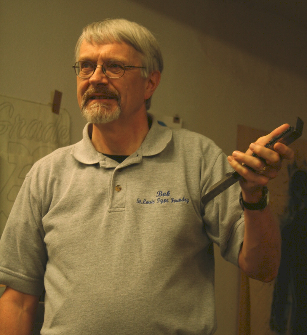
Author Bob Mullen illustrates a point in his talk on St. Louis type foundries.

Last Saturday my husband Bob gave a PowerPoint presentation at Firecracker Press, a letterpress specialty shop here in St. Louis. Bob’s talk, “Type Nerds Unite” on the history of type founding in St Louis attracted a good-sized crowd of enthusiastic young graphic designers and printers. Bob talked about the eleven type foundries that were in business in St. Louis between 1840-1925, comparing the trends in type design they showcased to overall decorative taste in each time period. Copies of his book, “Recasting A Craft” (Southern Illinois University Press – http://www.siupress.com) were available for sale. The creative energy was bouncing off the walls as the audience lined up to ask questions and get copies of their commemorative poster of the event.


Firecracker Press is a happening place. The excitement proprietor Eric Woods and his staff generate can be felt by anyone entering the shop on 2838 Cherokee Street. Colorful letterpress posters, greeting cards, journals, poetry chapbooks, buttons, and T-shirts entice you as you enter the showroom. Venture in a little further and you’ll hear the rumble of Vandercook presses and smell printer’s ink.


Creative advertising and promotion, community events series, and a strong web presence (check out http://www.firecrackerpress.com) have made Firecracker Press a highly successful letterpress business. The shop has become well known enough to be featured in the St. Louis Post-Dispatch and on St. Louis Public Radio (KWMU).

Eric and his three employees (shop manager Matty Kleinberg, Sarah Richardson, and Maggie Filla) and four seasonal interns keep incredibly busy, creating one-of-a-kind wedding invitations, business cards, poetry books, advertising for retail businesses, and specialty posters for clients like the St. Louis Science Center and Forest Park Forever. The majority of the designs are hand carved in wood, then printed in a rainbow of colors.

Hand carved wooden blocks form a background design for a Firecracker Press poster to be printed on the Mastercraft press.

Eric got hooked on letterpress at the Kansas City Art Institute while pursuing print-making and getting his degree in graphic design. He founded Firecracker Press in 2002, and after eight years is still fascinated with letterpress. “There’s something about the quality of letterpress. It a good way to combine design and printing,” he says, freely admitting that he loves both.

With an imaginative and hard-working crew, the ideas come easily. “We bounce things off each other,” he says. A look around the shop made it easy for me to see how much fun they’re having doing that.

Part of the Firecracker Press staff at the Vandercook: from right to left, shop manager Matty Kleinberg; proprietor Eric Woods; Sarah Richardson; and intern Ashford Stamper.

Firecracker Press is hosting a special series this year, including poetry readings (with the poetry printed on posters as the poets read on stage) and a chocolate tasting event that promises to be especially delicious.

Posters set and printed at Firecracker Press during a poetry reading.

Once you’re drawn into the shop, you’re hooked. You want to buy stuff. You want to play with type and cuts and get your hands inky. Your creativity quotient gets cranked up to maximum. Bravo to Eric and crew for introducing so many people in the St. Louis area to the unique quality and excitement of letterpress!

Two business cards for Firecracker Press. Notice the specially created advertising logo on top that looks like a matchbox.

Wednesday, August 11, 2010

I Love Cuts : Cuts of Women


I absolutely love cuts! These metal or wooden printer’s illustrations are addictive to collect. Big cuts, small cuts, plain cuts, fancy cuts, cuts of people, places, or things – there is no such thing as too many cuts. They’re one of the first things I look for at any printers’ swap meet.

One of the things that fascinates me about cuts is the things they show about the time when they were cast. Most cuts are line drawings, so like cartoons they tend to exaggerate stereotypes and perceptions. One subject that especially shows this is cuts of women. They can be roughly dated by their clothing, the way they’re drawn, and sometimes by their appearance in a specimen book.

A group of cartoon cuts we have of women (probably from the 1950’s) shows cute young women bending over to file, burning dinner, and even answering the phone in a towel from the shower while still wearing high heels. A “typical” housewife sings along with her Bakelite radio as she dries the dishes. The mood is light-hearted and frivolous, almost a Barbie doll-like caricature.


The artificial cheeriness of 1950’s ads turns up in the cut of a cowgirl with a lipstick-outlined grin. The cut of a woman under a barrel-like hair dryer in a beauty parlor is probably more realistic.


Contrast these to a circa 1930’s cut of a woman vacuuming her steps with a portable vacuum cleaner. Probably created as part of an ad campaign, this little cut shows a hard-working, no-nonsense woman during the Depression years. But the cut of the mysterious lady with the hat over one eye from a similar time period projects an air of intrigue.


Our cuts with a 1920’s feel show women who are seriously glamorous: a lady in a ruffled blouse in front of her mirror; and an elegant socialite dancing in a slinky gown and feather headdress. There are more stylized images, too, of a woman drinking a martini, and one with ripples of Art Nouveau style hair.


A circa World War I era cut shows a lady shopper, apparently sneaking home with an enormous new Easter hat, judging from the bunnies in the picture. The huge hats women wore then were a common joke.


One of our older cuts of women shows a 19th century woman in sunbonnet and muslin gown holding a basket of flowers. Though the cut is a bit worn, she looks sweet and innocent, part of a more rural society. The detailed copper engraving is characteristic of 19th century cuts, and makes them well worth seeking out. Though not easy to find, some still hide in the back rooms of older print shops or the corners of antique malls.


I wish we had more cuts of women! I’d love to have cuts of Gibson girls, women in hoop skirts, women in bloomers, or Rosie the Riveter women from World War II. Just like a snapshot, cuts show the way women were viewed not so long ago. And they’re certainly fun to collect!

Wednesday, August 4, 2010

Chuckwagon Charlie and His Missus

A visit to the Duerrs' home on Myrtle Avenue in Elmhurst, June 1962: from left to right, my mother, my sister, me, my dad, and Emerson Duerr.


From left to right, my mother, my sister, Blanche Duerr, me, and my dad. This time Emerson took the picture.


Two wonderful people I remember from my childhood in the Amalgamated Printers Association were Emerson Duerr (APA 273), who often called himself “Chuckwagon Charlie” in print, and his spirited wife Blanche. I met the Duerrs about 1960, when my dad was making frequent trips to Chicago to visit rare book libraries and printer friends.

Emerson Duerr ‘s main press was a huge Golding Art Jobber with a balky fountain that gave him fits. His favorite cut was an electro of a Civil War era woman with a train in the background, which my dad dubbed, “The Lady and the Locomotive.” He used it on most of his printing.

Emerson Duerr had a dry sense of humor in person and in his writing. His dead-on W.C. Fields imitation would make my sister and I giggle every time. He was a lawyer, but his field could have been comedy writing. My entire family looked forward to his letters. He deliberately exaggerated and misspelled words, signing himself, “Yore ole frend”, and talking about himself and “his missus” as he called Blanche.

Here’s an example of his writing, from a cooperative piece printed during a 1968 visit to our home in La Crosse, Wisconsin. In it he talks tongue in cheek about APA bundle submissions:
“Some of our members would be better craftsmen if they were acquainted with the interior arrangement of Mr. Webster’s word garage and its most effective use. It was suggested we hire Mr. Webster on a per diem and mileage basis to visit our members and properly orient them. This was ruled out because Noah Webster died in 1843 and is no longer available for such employment.
Then it was suggested that our Mailer, who is a college instructor, be authorized to exclude from the bundle any contribution containing a misteak in spelling. This was loudly hooted down as an invasion of the freedom of speech.
But what shall we do about members who think erroneously that they are ‘hobbiests’? Professor Wulling, an authority on words, concedes that an amateur printer is a hobbyist, but it is possible that this ‘hobbiest’ business is an effort to distinguish between degrees of amateurism. Thus, ‘You are a hobby printer, but I am a hobbier printer, and he is the hobbiest printer of us all.’”

Emerson’s wife Blanche was a lively grandmotherly type, spunky and full of fun. Her stories and home cooking made it a treat to visit her and Emerson in Elmhurst. Blanche looked like a sedate older woman, but she was not to be outdone. I remember when my family was riding with her and a teenager pulled up next to her at a stop sign in Elmhurst. He revved his engine, and yelled, “Want to race, grandma?” The daughter of an auto dealer, Blanche knew cars. She warned us all to hang on. When the light turned green, she floor boarded her big Buick, leaving her challenger far behind.

Emerson Duerr was in his sixties when we met him, and already suffering from a heart condition. After his death in 1972, my father and his frequent printing collaborator Emerson Wulling produced a memorial booklet in his honor entitled “Yore Ole Frend, CWC”. I helped with the booklet, shown below.

One of the joys of printing is meeting other people who print. I’m so glad I had the opportunity to know “Chuckwagon Charlie and His Missus” – two outstanding human beings.


Cooperative piece printed during the Duerrs' visit to our home in La Crosse, Wisconsin, August 1968.


Memorial booklet for Emerson Duerr, produced by Gary Hantke and Emerson Wulling. "The Lady and the Locomotive" cut is featured.

Tuesday, July 27, 2010

Come Over and Print!


One of the great things about having our own print shop is inviting friends over to print. We get to share our hobby with others and have a get-together with people we like. Often we share lunch or dinner, too. It’s a fun way to socialize and to do something we enjoy at the same time.

This past weekend we had our friend Lynn over to print a bookmark. She’d chosen a favorite quote on writing, an interest she and I share. Lynn is my writing partner, and got me started blogging. Her weekly blog, Present Letters, is a memoir written as a series of letters to her mother. You can view it at this web address: http://www.lynnobermoeller.blogspot.com. Her blog this week features her write-up and pictures of her printing session at our house.

Lynn has worked in our print shop before, so she knows something about letterpress. And she’s willing to be patient and work with a project until it looks just right.

We began by suggesting possibilities for typefaces. Since we have over 900 fonts, it helps to narrow things down a little! Lynn chose Grolier, an old MacKellar Smiths and Jordan script patented in 1887. After she set it in 24 point, the quote filled three lines, a nice size for a bookmark.

Lynn looked at a number of cuts that related to books and writing. She ended up with an older cut of a quill pen and inkwell that harmonized well with the quote. She proofed the type she’d set on our Poco proof press, and corrected the inevitable typos.

We dug around on our paper shelves and came up with some possibilities. Lynn decided on a heavyweight grey stock and black ink – a classic look. She also set “Printed by Lynn Obermoeller in the Mullens’ Printshop” in 8 point Garamont vertically at the right end of the bookmark.

After a little more tweaking to position the cut in just the right spot, the form was ready for lockup. We inked up our 8 x 12 Chandler and Price, put the chase in the press, and positioned the gauge pins.

The first impression on plain paper was nice and even – no big makeready problems this time! A few more measurements with the line gauge to make sure everything was straight, and the bookmark was ready to roll. Showtime! Lynn hand-turned the big flywheel of the press and triumphantly held up her first impression. Perfect!

She produced several more bookmarks for an edition of 75. Then this most courteous of guests helped us distribute the form! After all the letters, spaces, leads, and slugs were back in place, we adjourned upstairs to gloat over the bookmark we’d printed. What a fun way to spend time with a friend – come over and print something! We heartily recommend it.

Lynn sets type for the quote on her bookmark.


The form is locked up in the chase, ready for the press.

Wednesday, July 21, 2010

Al Frank's "Boutique de Junque"


While attending the 1968 APA Wayzgoose with my family, I got the opportunity to visit a printer’s landmark now long gone − Al Frank’s printing supply warehouse at 947 West Cullerton in Chicago. I had to beg to go there with my dad and our printer friends the Worleys. The neighborhood surrounding the place was rundown and rough, not a place to take your teenaged daughter. But Lillian Worley helped me to talk my dad into it, and so the four of us set off.

By 1968 Al Frank’s “Boutique de Junque” was a well known printer’s mecca. In the printing salvage business since 1931, Al had stuffed five cavernous floors with presses, cutters, type, cuts, borders, galleys, and whatnot hauled in from print shops he bought. Everything was jumbled throughout the warehouse, but there was a rough order to the place: machinery on the first floor, wood type and miscellaneous on the second floor, metal type on three, equipment on four, and the overflow crammed onto five.

The building had its own character. Stairs and a balky freight elevator connected the floors. Plumbing was ancient and often non-functional. I felt lucky to be there in summer, since Dad had told me how cold the unheated building was in the winter months. The only way to warm up in winter was to join Al on the loading dock, where he burned junky cuts and beat-up type cases in an old 55 gallon drum.

The place was informal to say the least. There were no signs or price tags. You foraged through the warehouse, then brought things to Al, who’d squint at your pile of loot and name a price. I felt excited to be there, and was determined to help my dad find the good stuff. And I didn’t care how much dirt I had to plow through to do it!

I eagerly explored all five floors. Dusty type cabinets, heaps of galleys, skids of paper, and piles of standing forms mingled with old bathroom fixtures pulled out of print shops. In the middle of summer it was hot and sticky, especially on five. Pigeons cooed in the rafters and dotted merchandise with droppings. Never one to be daunted, Lillian Worley checked a metal rack swathed in plastic and discovered a line of women’s dresses. “You know, these aren’t half bad,” she said, laughing as she pulled one out and held it up for size.

As he always did at Al Frank’s, my father found typographical gold that day: a handful of old cuts, some beautiful borders, and a couple of quaint old typefaces half hidden in the dust and debris. And I loved being there, too. Visiting Al Frank’s was a huge thrill, a marvelous printing treasure trove that I wanted to see again. But as luck would have it, I never did. And in 1981, the big old warehouse burned to the ground. There was almost nothing left for Al’s son Jack Frank to salvage other than scrap metal.

The demise of Al Frank’s “Boutique de Junque” marked the end of an era of supreme typographical treasure hunting. But anyone who was there will never forget the place. What an adventure!

An early business card of Al Frank's, pre-dating modern telephone numbers and zip codes.

Wednesday, July 14, 2010

Border Piece Reunion


Have you been to a class reunion? Some people look the same, others you wouldn’t know if you passed them on the street. Yet you share memories of a time when you were together.

I like to imagine that for pieces of old combination borders, it’s like a “border piece reunion”. Corners, flourishes, and doodads that have been separated for years are now in the process of being reunited in our print shop.

It started with my husband and I labeling some metal drawers full of border, separated for years in my dad's typecases. We decided to number the drawers and print pressure sensitive samples for the front of them. As we set specimen lines of borders, we began to notice border pieces that belonged with other border pieces.

Many borders are simple, consisting of a single character or a character with corners. But others, we discovered, are more involved. Border pieces that look nothing alike can combine to form intricate patterns. Some of the more elaborate combination borders, such as those once manufactured by MacKellar, Smiths, and Jordan Type Foundry, create entire scenes. Yet border pieces are often separated in print shops since they don’t resemble each other.

We started studying specimen books, and soon books were spread all over the house. What started as an afternoon’s labeling project became an obsession as we discovered more border pieces that went together.

As we worked, combination borders began to slowly reunite in our cases. Inexplicable squiggles and boring lines joined fancy cartouches and alternate corners to form new borders. Often a few characters in a border were missing. Then, hooray! − we’d find them in another case or galley. What a thrill, to see an old border back together again after so many years! Often some characters were acquired from one print shop and the rest from another.

For example, Combination Border #99 by MacKellar, Smiths, and Jordan, patented in 1885 by Herman Ihlenberg, combines loops and swirls of ribbon with small floral pieces and pictures of cherubs. We didn’t realize it, but we already had the ribbon pieces from my father’s print shop, acquired in La Crosse, Wisconsin and Duluth, Minnesota years ago. Then we bought a dusty, battered case filled with old border pieces from an antique shop in Paducah, Kentucky. That case included small floral pieces from the same border. We still don’t have the cherubs, but we now have enough border pieces to print Combination Border #99.

And that’s just one success story: we’ve found Gray Border, Mazarin Ornaments, Abbot Border, Stylus Border, and others. Exciting to see these old borders reunited again − and now they’re more usable to us, too!


Border pieces for Combination Border Number 99,designed by Herman Ihlenberg for MacKellar, Smiths, and Jordan in 1885.


Our metal border drawers are easier to use now that they're labeled.


Border drawer containing Gray Border, Combination Border #99, Mazarin Ornaments, and others.