Friday, September 14, 2012

Extinct Typefaces

Can typefaces become extinct, like dinosaurs? Not quite, but they can become hard to find. Computers offer fonts galore. But one of the delights of being a letterpress printer is the ability to use fonts that are available only in metal or wood. Personally I love using typefaces you can’t find in font software or on the Internet. That way nobody will pick up my letterpress printing and say, “Did you do this on your computer?” Ouch! Not the best thing to say to someone who’s spent hours setting slivers of metal type by hand.

Here are a few of my favorite extinct typefaces. These are creations of the 19th century, though some more modern faces have become extinct, too.

Scribner, illustrated above and at the top of this page, can best be described as eccentric. The wiggly, curlicued letters, designed by the Central Type Foundry of St. Louis in 1883, seem to wander all over the place. Below is a piece we printed that takes advantage of this tendency.
The “Attitudes” piece above is printed in Grolier, an elegant MacKellar, Smiths, and Jordan script from 1887 designed by Herman Ihlenberg. This lovely face is hard to find, sadly. My husband Bob and I have metal fonts of it in 12, 18, and 24 point. Its fragile kerns have held up over time thanks to careful storage and babying. The design is timeless, as beautiful in the 21st century as when it was created. Below is a valentine that shows off some of Grolier’s gorgeous capital letters.


Vertical Writing is another favorite of mine that you don’t find available very often. Joseph W. Phinney patented it 1898 for the Boston branch of American Type Founders. Designed to look like informal 19th century handwriting, its letters appear to be fully connected and widely spaced. It’s surprisingly legible, and quite charming in an old-fashioned way.
If you’re sad because you don’t have “extinct typefaces” at your disposal, there’s a way to remedy that. Some of the older fonts are being recast and are available again.

One of my favorites is Freak, recently produced by Sky Shipley of Skyline Type Foundry http://skylinetype.com. This wildly eccentric 1889 gem is pictured below.

Yes, fonts are fun, and especially if you’re using one that very few people commonly see. Using extinct typefaces is a big perk of letterpress printing. It’s great to be able to share them with the world!


Tuesday, March 20, 2012

River Rat Printers


My husband and I have spent most of our lives along the Mississippi River, appreciating both old time letterpress printing and the romance of the steamboat era. We began in La Crosse, Wisconsin, moved downriver to Lynxville, Wisconsin, then to St. Louis, Missouri. We’ve learned that our twin interests are more linked than you might imagine: newspaper printing was the mass media of the 19th century, and riverboats a major form of transportation. The Mississippi was like a super highway in those days, and printers depended on it to deliver presses, type, and paper, and distribute news up and down the river.


As printers interested in history, we’ve done quite a few pieces relating to riverboats. Our first was “A Little Book of Steamboat Puns”, a small booklet of atrocious river puns we made up ourselves. Though the puns were bad, the booklet was nice. We gave a copy to the late John Hartford, musician and river lover, at one of his performances. Years later we met him again, and he actually remembered our booklet. Maybe it was because the puns were so awful.


While in St. Louis we became volunteers at the Golden Eagle River Museum, and got to use our riverboat cuts some more. We printed programs, name badges, and bookmarks for the group.


We also added to our riverboat cut collection through the generosity of Golden Eagle members. Irv Braun had worked for transportation printer Con Curran, and saved many railroad and riverboat cuts from oblivion when the company switched from letterpress to offset. And James Swift, known to everybody as Jimmy, was a writer and historian for the Waterways Journal, a St. Louis based river magazine. Jimmy bequeathed his collection of river cuts to us. Some of our cuts from Irv and Jimmy are shown below.


While in St. Louis, we actually had the opportunity to print on a steamboat. The Bibliographical Society of America hosted a Mississippi River cruise at its 2004 meeting. Bob and I hauled a Baltimorean table top press, paper, and supplies over uneven riverfront cobblestones and onto the boat, where we were offered a small, wobbly table to set up. We wondered if any of the attendees from major libraries and rare book rooms would want to bother printing our little bookmark. To our surprise, we had a long line. People were thrilled to have the opportunity to print something themselves.


Years later we once again find ourselves printing along the Mississippi River, this time back in our hometown of La Crosse. We’ve come full circle, and we wonder what links between letterpress printing and the river we’ll discover this time around!

Wednesday, September 21, 2011

Type Lust: It's A Good Thing!


How many fonts of type are enough? 200? 500? 1000? And how many cuts, borders, and ornaments does a person need? For letterpress printers there’s always another typeface, border, or cut just around the corner. It’s truly an addiction, and pretty much incurable. But there’s a lot of fun and camaraderie along the way.

My husband Bob and I enjoyed that camaraderie this past weekend at the Great Northern Printers’ Fair in Mount Pleasant, Iowa. This three day affair offers both new and experienced printers the opportunity to actually use any of the machines housed at Printers’ Hall. If you’re new you can ask for coaching on a machine, and you’ll get a printer who’s happy to walk you through the process.

On Friday afternoon Bob and I tried out the Reliance hand press, a newly renovated addition to the Printers’ Hall collection. With our older, worn wood type, inexperience with a hand press, and some problems with the alignment of the platen and bed of the press, we had difficulty getting a good impression. Probably with a little more time we could have gotten it right. But we had a great time anyway, and learned something about printing on hand presses in the process. No point in hanging back, you’ve got to jump in and get your hands dirty!


Below are some of the projects that were going on in Printers’ Hall at the Great Northern. All kinds of presses were in action, including the giant Babcock newspaper press. Printers young and old tried their hand at using the various machines.


The Saturday swap meet was certainly a highlight of the weekend. Eager buyers checked out the rectangle of tables early, looking for treasure. It was a typographical feeding frenzy, true type lust gone wild. What was out there? Would that long sought after typeface, border, or cut be on somebody’s sale table?


After the first rush the group settled in, making the circuit over and over, buying, selling, talking. As exotic wood type fonts and old specimen books sold, interest in rusty galleys and guess-what-it-is press parts picked up. There was plenty of time to chat, exchange ideas and printing samples, and get to know the other people there.


Personally, we had a great time! We met a lot of talented young printers just starting out, and caught up with some of our long-time printing friends at the same time. United in our love for the same fascinating, inky process, time truly flew by. Will we be back next year? You’d better believe it!

Wednesday, August 31, 2011

Moving A Print Shop: Not For Wimps!


Moving a letterpress print shop is not for the faint of heart. It’s not something you undertake lightly, pardon the pun! Yet move a print shop we did, and not just across town but some 450 miles. It was an ordeal to put it mildly, but happily we and the shop emerged unscathed in the end.

The moving process began with packaging over 600 type cases, cut cases, galleys, and miscellaneous items for transit. We used cardboard and stretch wrap to protect type and cuts from spilling or being scratched up.


Here’s a shot of my husband Bob hauling type from the basement into a staging area in the garage of our old house. It was a major workout for him, with the obstacles of a narrow stairwell, doors in the way, and a hairpin turn at the top of the stairs.


Over several weeks, the garage filled. A hobby printing friend dismantled our 8x12 Chandler and Price press, 7x11 Pearl press, and Peerless Gem paper cutter for the move. We rented a truck, then a van to haul some of the paper, cuts, and type, then hired professional movers to do the rest.


Moving day came, and we hoped we were ready. Our four movers were big strong guys. They quickly set to work loading the shop and our entire household onto a moving van. The biggest challenge for them was getting our 8x12 C & P press up the stairs. Even stripped down, the press weighed some 500 pounds. I think the sound of it coming upstairs one step at a time (1-2-3... whump!) and shaking the entire house will haunt me for a long time.


Meanwhile at our new house, we had to plan what to put where in the new printshop. Armed with our many measurements and painter’s tape, we arranged and rearranged. We figured once something was in place, we weren’t about to go moving it! We divided our print shop into three areas: the main shop downstairs, a print studio upstairs for designing and proofing pieces, and a paper storage space in the utility room.


The movers arriving and the unloading began. We were amazed how smoothly it all went. Most of the type cases were moved from garage to garage.


Over the next few weeks, my husband Bob began hauling type cases into the new print shop. It was easier going down with a wider stairway. We arranged, rearranged, unpacked, and fiddled with the new shop and print studio. It was a challenge thinking of how to set up two locations to operate efficiently, and one we’re still fine-tuning.


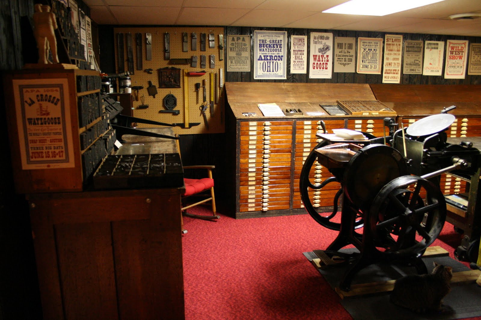
But here's our new, red-carpeted print shop, complete with autumn mural, and our upstairs printing studio. We’re finally ready to print, after over three months of moving the shop. And we have promised ourselves NEVER to move again! But all in all, it went well. Hooray, Xanadu Press is up and running!


Wednesday, May 11, 2011

The Perfect Print Shop


What letterpress printer doesn’t dream about the perfect print shop? I know my father Gary Hantke did. No matter how many fonts of type or ornaments or borders are in any print shop, there’s always that one illusive item that would make it absolutely perfect.

But by the end of the 1980’s, my father had assembled a pretty amazing print shop, full of wonderful type, cuts, or other printing paraphernalia. Decades of hard work and patient sorting had given him literally tons of options for printing.

Unfortunately in the last two years of his life Dad was too ill to print. His declining health wouldn’t allow him to stand and set type, much less run the printing press. He tried to content himself with immersion in one of his other hobbies, stamps. But more than once Dad told me how much he wished he could print.

After my father’s passing in 1990, my husband and I printed a flyer to be given away to those attending the memorial service. A good printer friend, Rich Hopkins of Hill and Dale Press, produced a booklet of his memories of my father that was distributed throughout our APA printing hobbyist group.


As the months wore on after his death, I wonder how Dad was doing. I missed him terribly. Was he happy? Was he still separated from the printing hobby he loved so much?

Then one night I had a dream. In it I saw my father in a huge, beautiful print shop. He was designing printed pieces, happily collaborating with printing friends who had passed on before him ― Emerson Duerr, Jim Eckman, Norman Forgue, and others.

The unique thing about this print shop in the dream was that it was absolutely unlimited. No type, cut, ornament, or border was lacking. Anytime a printer needed anything, all he or she had to do was think of the item and it would manifest, ready for use. All the setting and press work was still done by hand. That’s the fun of the hobby, after all. But anything a printer could imagine using ― like ornaments from the Bruce Foundry, or fanciful borders from MacKellar, Smiths, and Jordan ― was available instantly through thought.

What a print shop! It made me so happy to think about Dad working there, enjoying the company of his dearest friends.

This printing blog was started a year ago, and it’s been a joy to produce. With a long-distance move of the print shop in my husband’s and my near future however (see April 27th blog), I’ll be taking a break until the move is complete, possibly some time in June. By then I’m sure there’ll be lots more to share.

I’ll close for now with the printed piece my father always kept posted over his Chandler and Price press. Since the long s characters make it hard to read, here’s the text: “I have been obliged by the sheer Weight of Fatigue to leave my Post, & repair to my Dwelling-house, until I have recovered my usual Composure. All Patrons will find me of a cheerful Demeanor, and in good Readiness for Business or for Consultation upon my Return on the Morrow.”

Wednesday, May 4, 2011

Letterpress for Mother's Day


Though not a printer herself, my mother Ruth was always a big supporter of letterpress. She had an eye for good design, too. Often my father Gary Hantke would have her proofread and take a look at a piece he was about to print. Mom would catch the typos and suggest a bit of white space here or there.

Mom became good friends with several of the printer’s wives, and enjoyed attending Dad’s annual APA printing conventions. Often she managed to charm free cuts, paper, or ink from vendors at the swap meets. Mom and Dad even took a month long trip to Europe with one of the couples from APA.


She was also a wonderful mother. My sister and I never lacked for attention. She sewed our Halloween costumes, Easter and Christmas dresses, and spring and fall wardrobes. She loved to garden and play the piano, and was an excellent cook whose homemade bread, coffeecakes and pizza were legend.

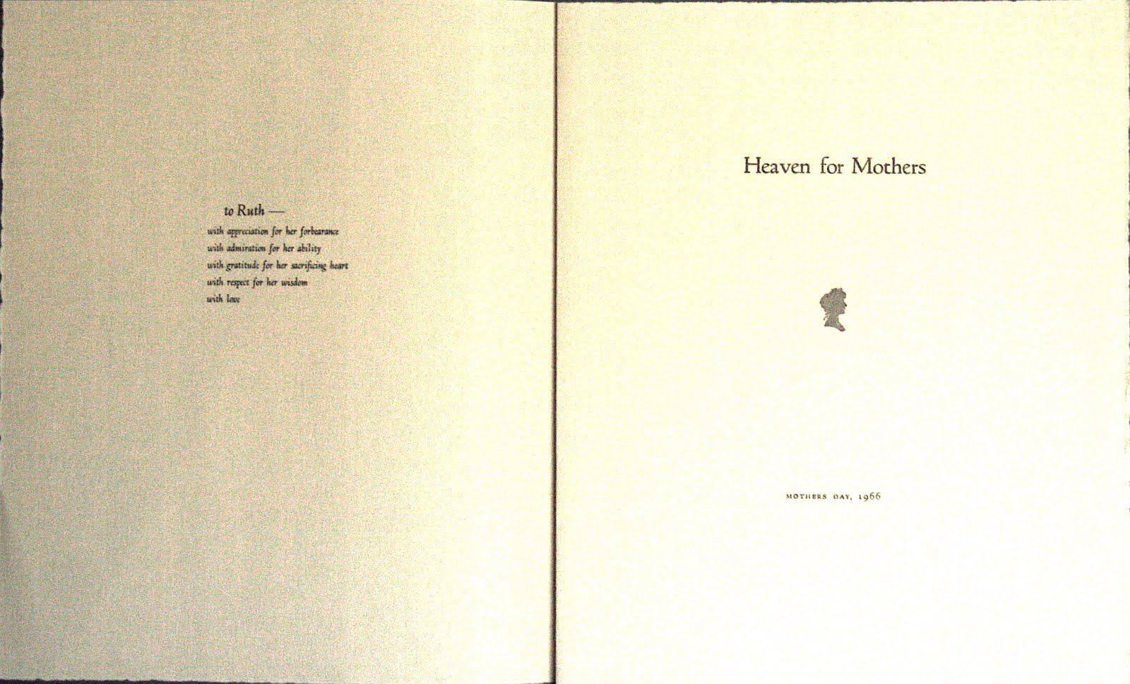
In 1966 Dad printed a lovely poetry booklet for Mother’s Day and gave it to her. All that setting and design work, and he just printed one copy ― for her. I found it with some of her papers after she died.


After my mother’s death in 2008, my husband and I printed a memorial piece in her honor. The type was Murray Hill, her favorite typeface, and the quote was surrounded by a border of flowers and musical notes.


I miss you, Mom! Thank you for all you taught me and gave me. And Happy Mother’s Day. Love, Carole